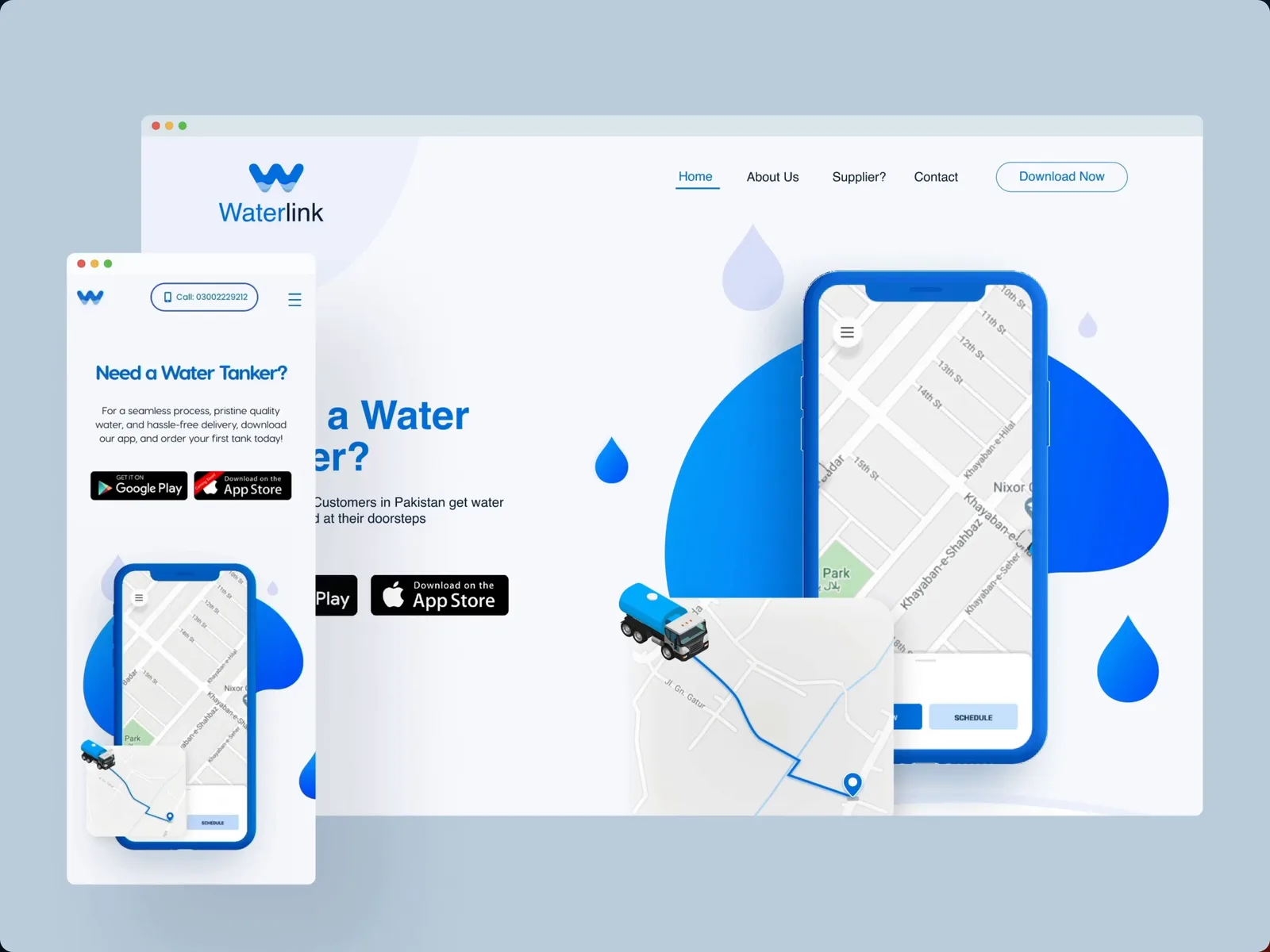
Waterlink
A water-tanker delivery app for Karachi — booking, scheduling, driver acceptance and a wallet, in English and Urdu.
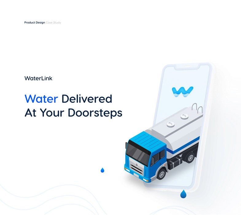
At a glance
- role
- UX & UI design, brand
- company
- Waterlink
- year
- 2020
- platform
- iOS, Android, web
- scope
- Customer app, driver flow, marketing site
- tools
- Adobe XD, Illustrator, Photoshop, Figma
Context
Waterlink delivers water tankers to people’s doorsteps in Pakistan. Karachi is the first city: apartments, houses and local businesses that all need water on a schedule nobody controls.
The vision was a well-organised delivery system, put in front of a problem that had been running on phone calls and word of mouth.
Problem
The discovery work turned up an absence rather than a competitor. There was no convenient, user-friendly way to get a tanker — which meant the opportunity was not to beat an existing app, but to design the category from nothing.
What that left us to solve
- No way to see what a tanker costs before committing to it
- No way to know when it would arrive
- Nothing that let a customer plan ahead for a delivery they knew they would need
- Nothing on the driver’s side either — an order has two ends, and both needed a screen
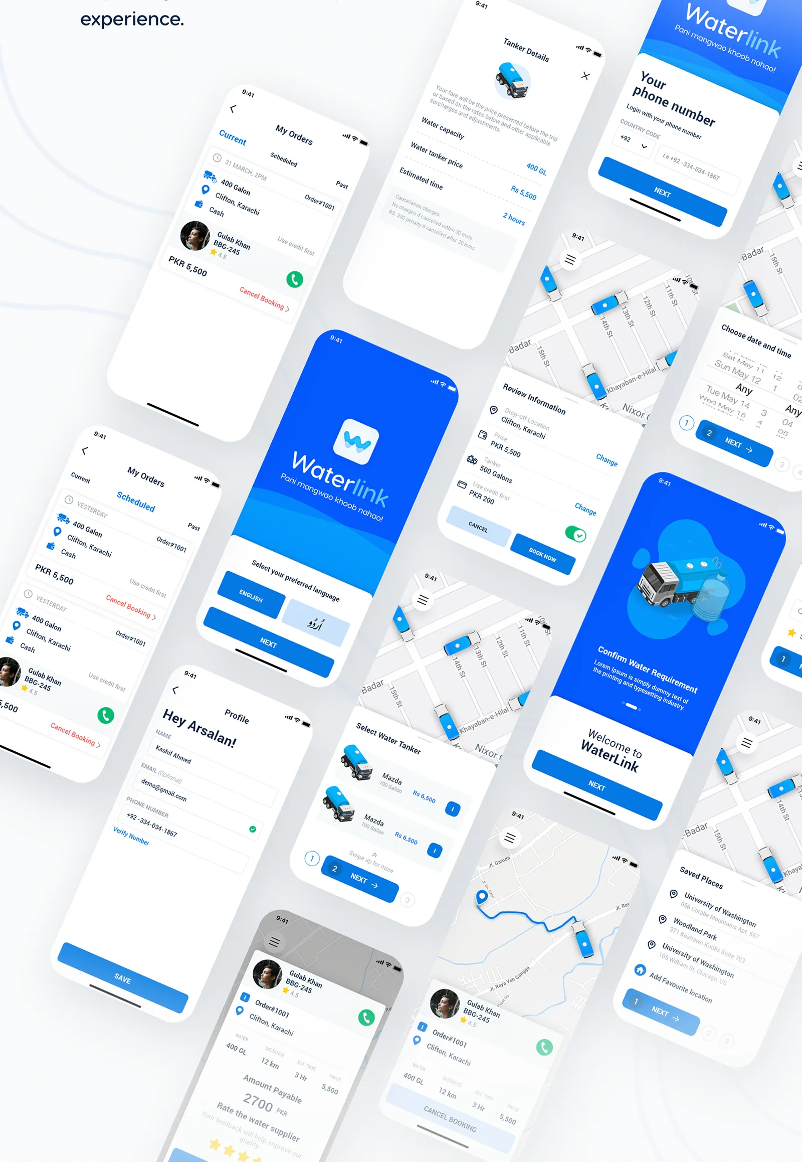
- An audience who mostly do not read interfaces in English
Process
Research first, then flows, then screens — the order I have kept ever since.
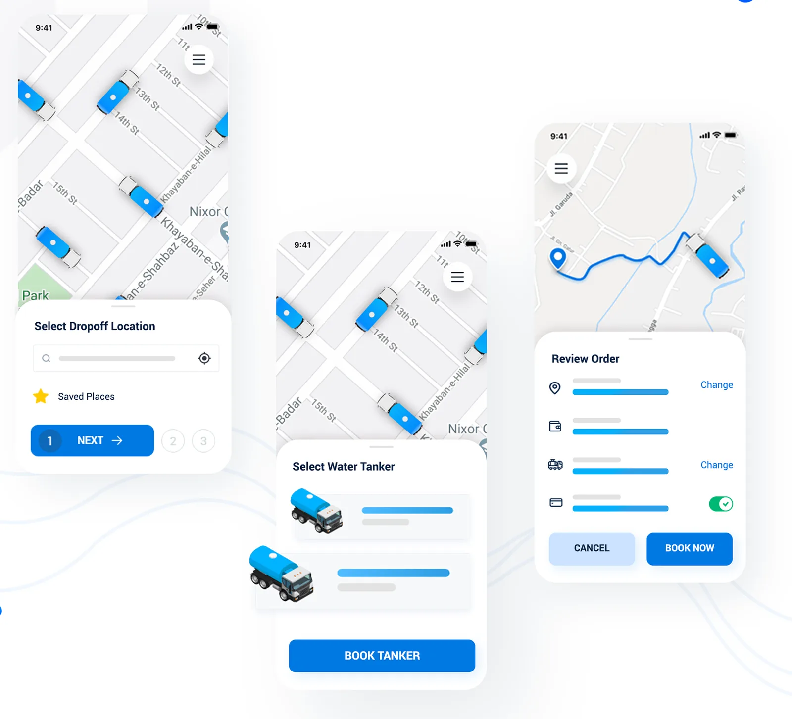
I mapped what a delivery actually involves before drawing anything: who asks for water, who carries it, what each of them needs to know at the moment they need to know it. That produced two journeys rather than one, and a booking flow short enough that a first-time user could finish it.
How the booking flow was cut down
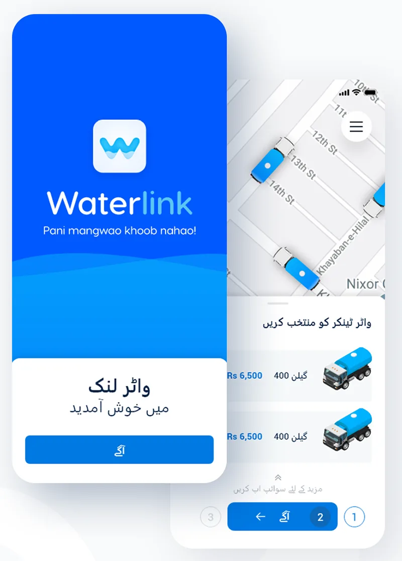
- Three steps, numbered on screen, so you always know how far in you are →
- Location first — the map does the work, saved places do the rest
- Tanker second — sizes and prices side by side, nothing hidden until checkout
- Review last — every line changeable without going back to the start
Solution
Four pieces, each answering one of the gaps discovery found.
Scheduling. Water need is predictable; deliveries were not. Pre-ordering turned a scramble into a calendar entry, with custom date and time, a choice of tanker sizes and payment set up ahead.
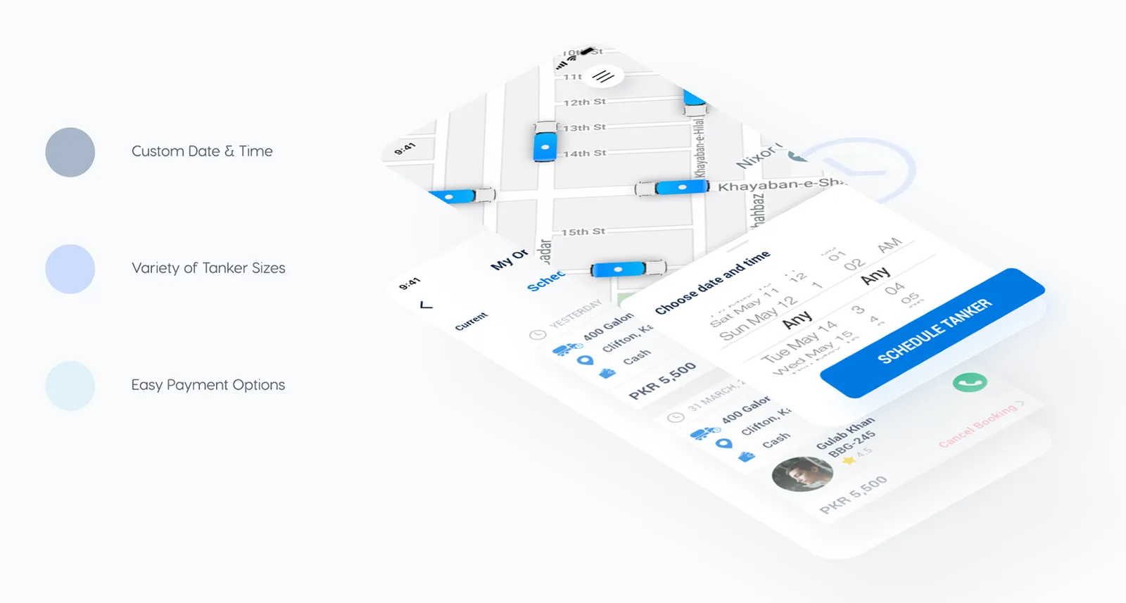
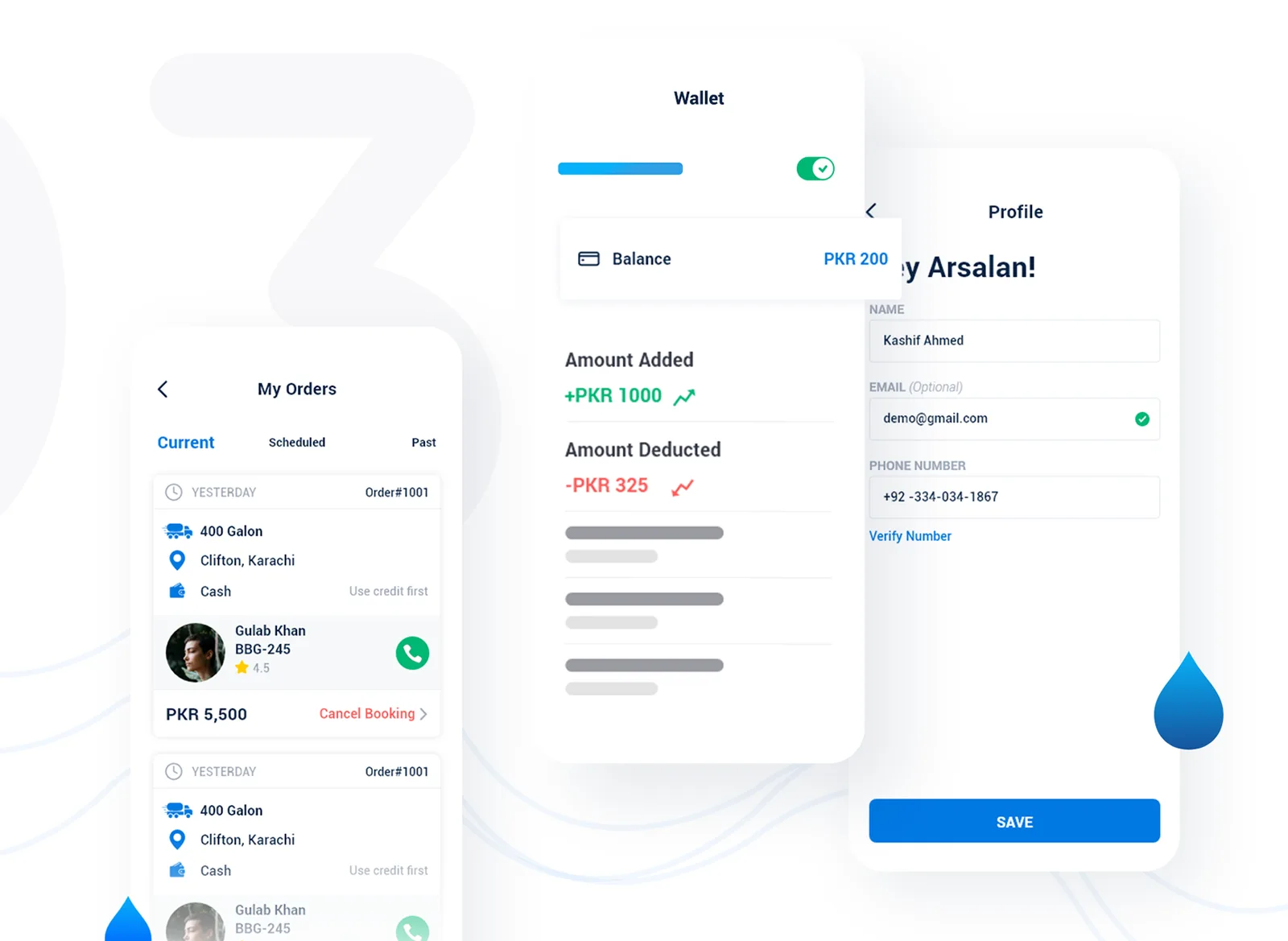
Managing an order. Current and past orders in one list, the driver reachable by one tap, a wallet that shows what went in and what came out, and a profile with a verified number so the tanker reaches the right door.
Urdu. Not a translation layer bolted on at the end. The app switches to Urdu as a native language because that is what most of its users read — the choice sits in onboarding, before anything else is asked of them.
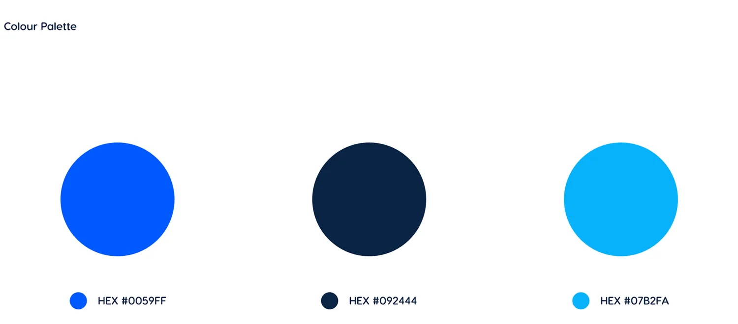
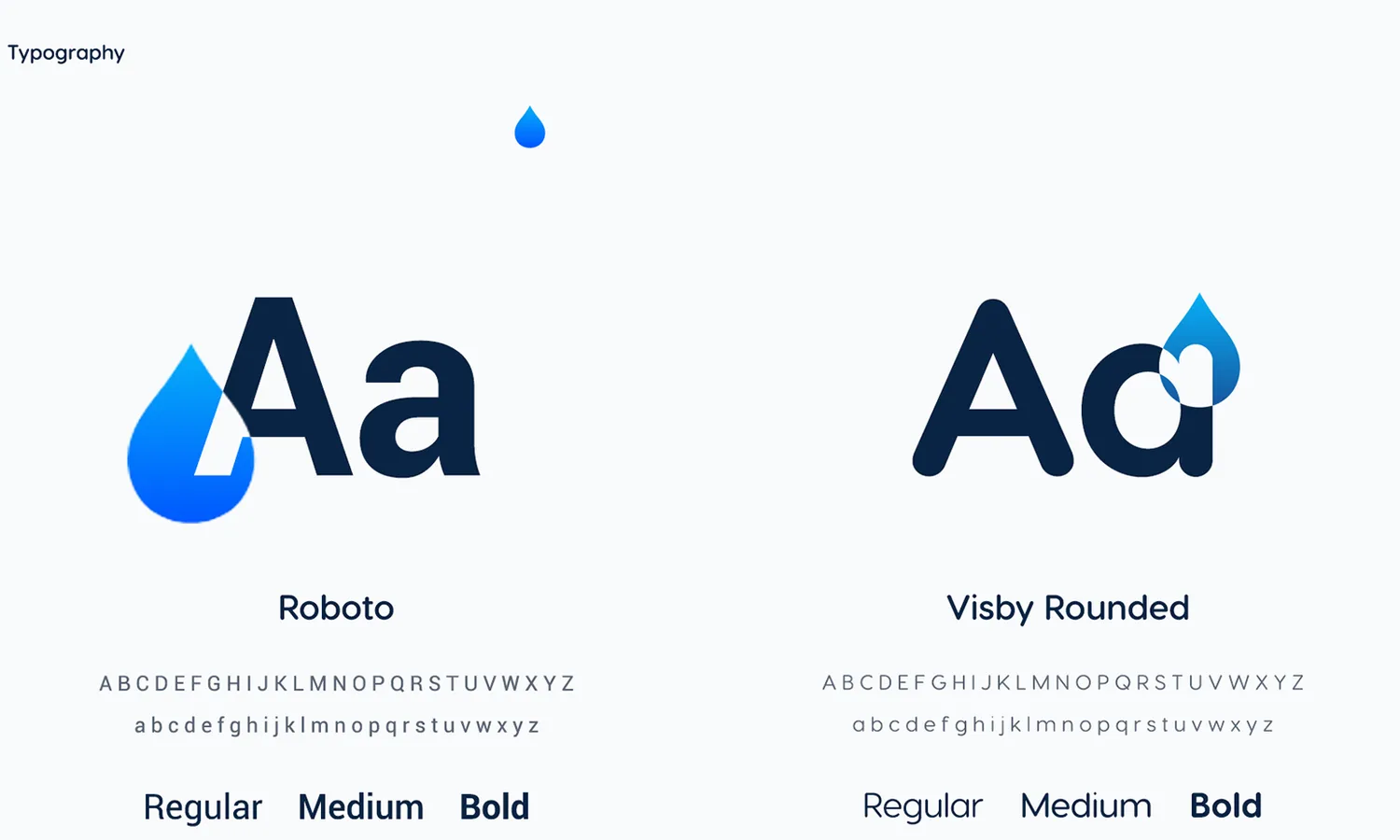
A brand to hang it on. A logo built from a water drop and a W, one blue for action and one navy for ground, and two typefaces — Roboto to be read, Visby Rounded to be recognised.

Outcome
Waterlink shipped as a complete product: a customer app that books, schedules and pays; a driver flow that accepts and completes; a marketing site; and a brand system documented well enough that people who were not in the room could build on it.
The part I am still pleased with is the Urdu support. It was argued for on user need rather than on scope, and it was the decision that made the app usable by the people it was actually built for.
Public performance numbers for this one are not mine to publish.
Reflection
I would run the driver side earlier. It was designed after the customer app was settled, and a few decisions on the customer end — how an order is described, how far ahead it can be placed — would have been easier if both ends had been on the wall at the same time.
I would also test the three-step booking flow with people who had never seen a delivery app. It reads as obvious to a designer. That is exactly the kind of thing worth checking.