OmniCloud
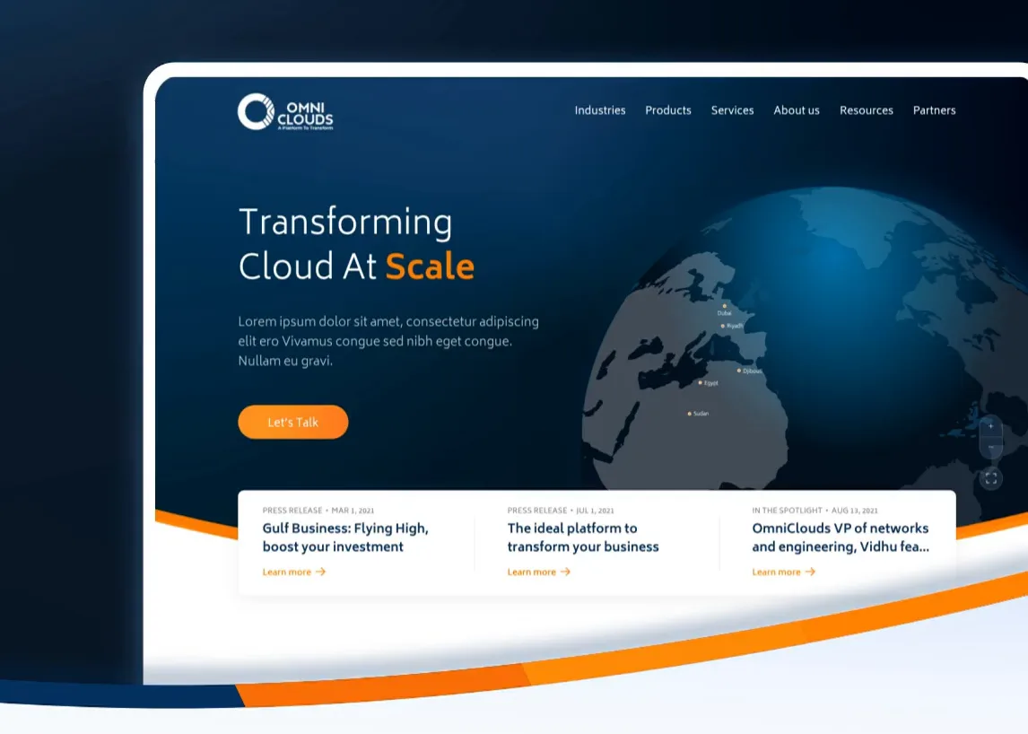
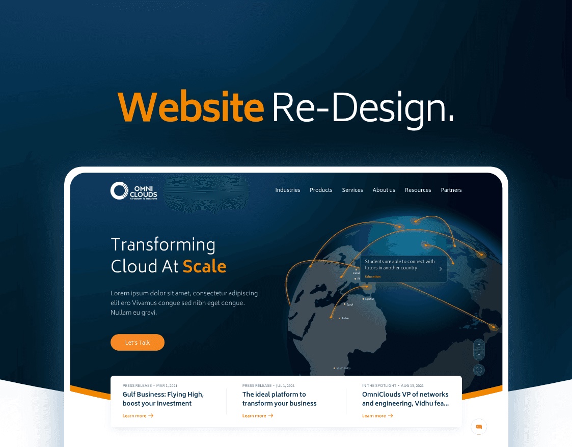
A website re-design for a cloud networking platform — turning WAN transformation into something a buyer can actually follow.
At a glance
- role
- UX & UI, illustration, system
- client
- OmniClouds
- year
- 2021
- platform
- Responsive web
- scope
- Sitemap, grid, style guide, pages, illustration, motion
- tools
- Adobe XD, Illustrator, Photoshop, Lottie
Context
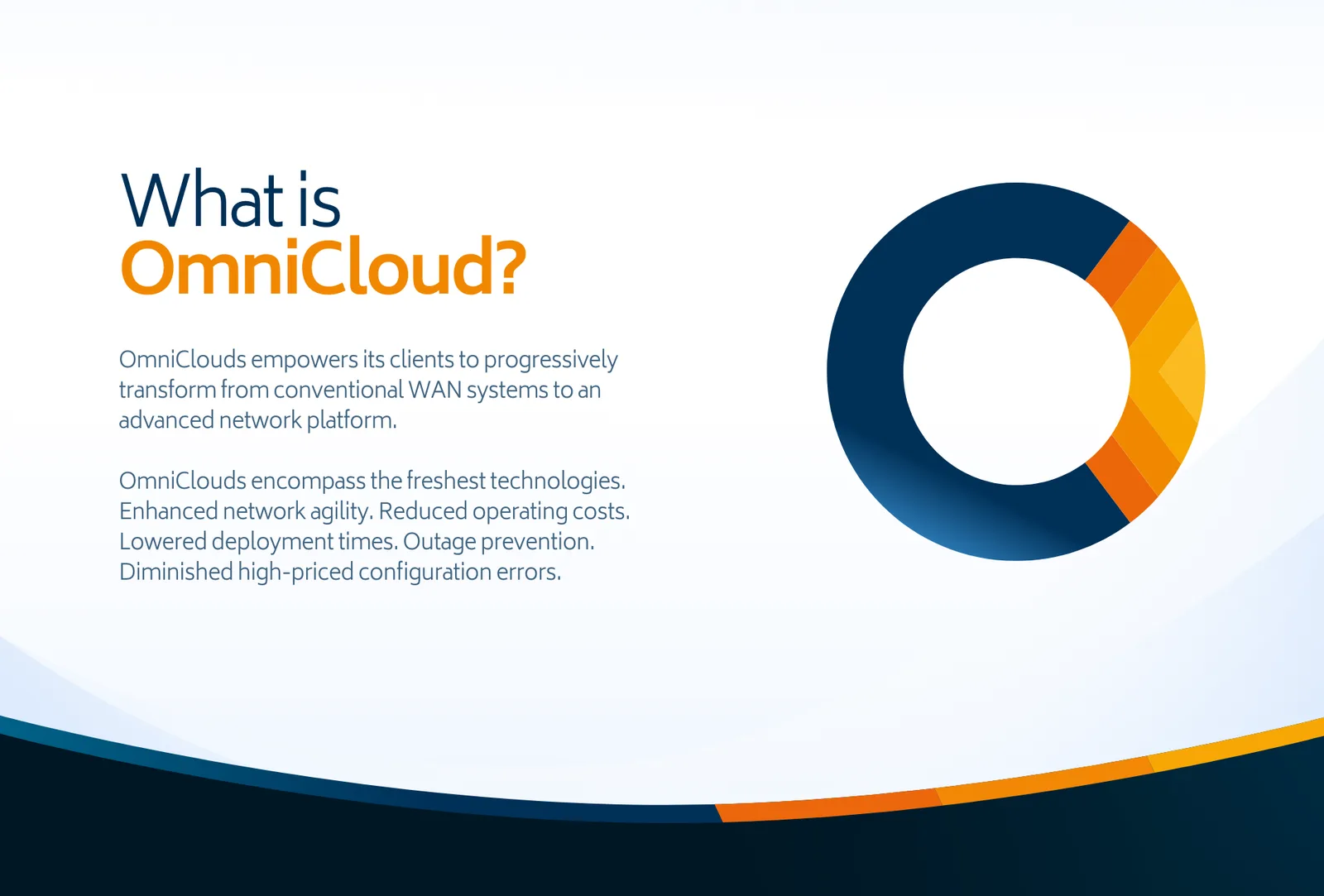
OmniClouds empowers its clients to move, progressively, from conventional WAN systems to an advanced network platform.
What they sell is genuinely hard to picture: enhanced network agility, reduced operating costs, lowered deployment times, outage prevention, fewer high-priced configuration errors. All real, all invisible. The site had to make an abstraction feel like a product.
Problem
This was a re-design, which means the failure was already on the page and my job was to name it.
What the old site could not do
- Explain a service nobody can see — enterprise networking has no product shot
- Hold together across a growing set of industries, services, products and partners
- Read as credible to a buyer spending real money on infrastructure
- Work on a phone, where a good share of that buyer’s first look actually happens
So the work started at the structure, not the surface.
Process
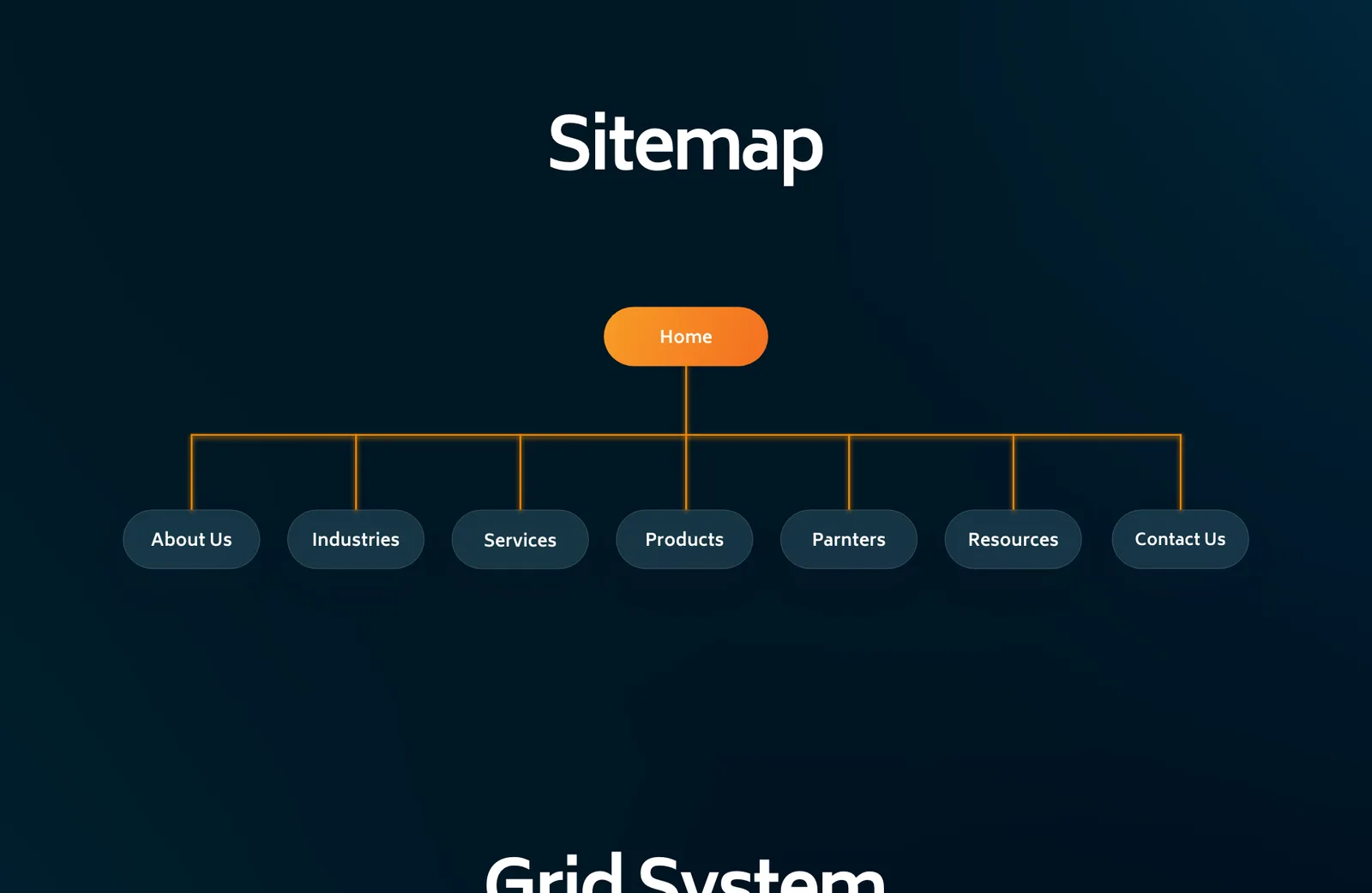
Sitemap first. Home branching to About, Industries, Services, Products, Partners, Resources and Contact — agreed before a single page was drawn, so arguments about navigation happened on a diagram instead of in a mock-up.
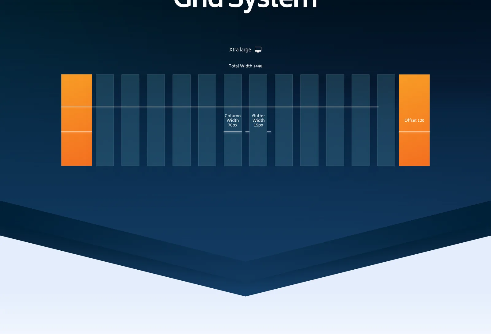
Then the grid. A twelve-column system with defined margins and gutters, so every page after the first was an assembly job rather than a fresh composition — and so the build could be handed over without ambiguity.
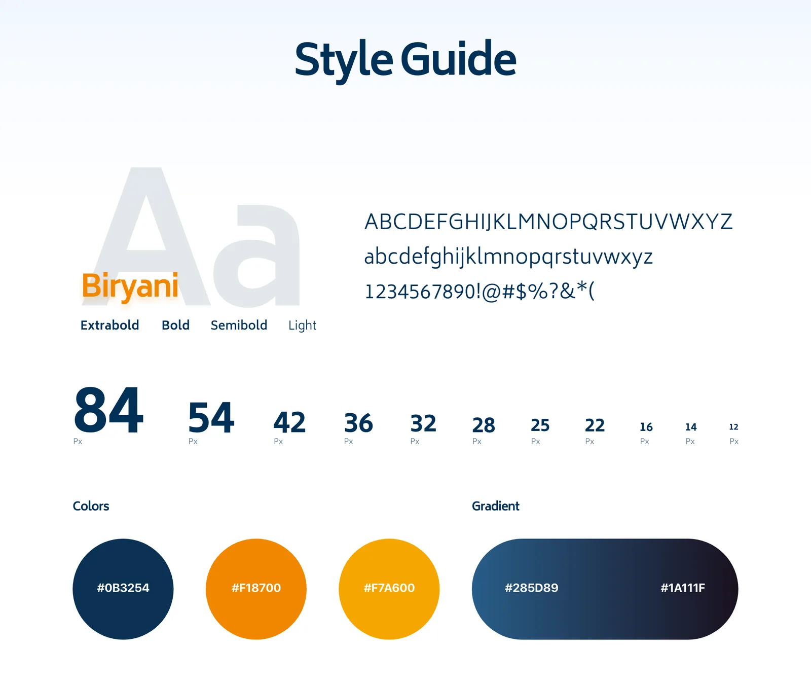
Then the language. Biryani in four weights across an eleven-step scale from 84px down to 12px; a navy that grounds the page, two oranges that carry every action, and one gradient for the dark sections.
Solution
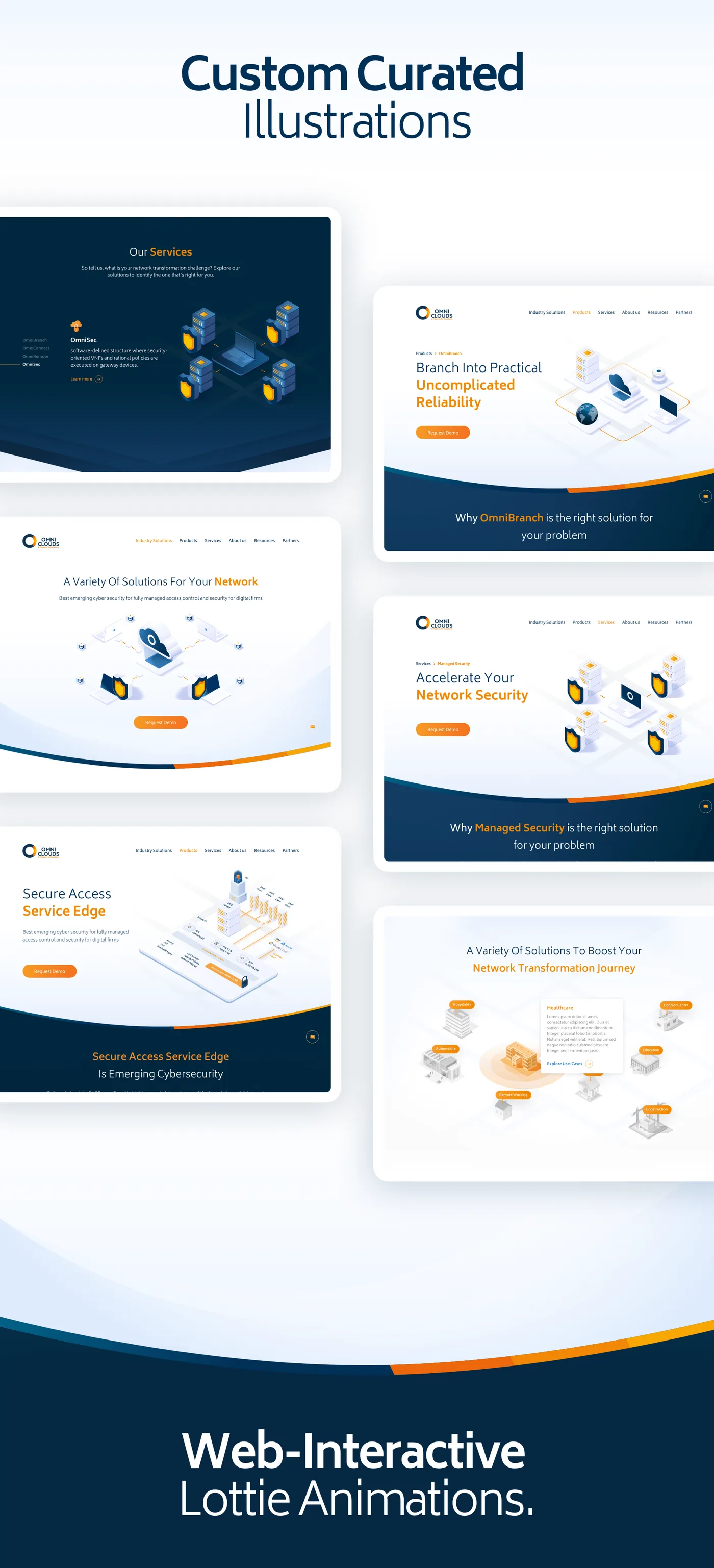
Illustration does the explaining. Since there was nothing to photograph, I directed a custom set: isometric servers, laptops and network nodes in the brand palette, each one drawn for a specific claim on a specific page rather than pulled from a library.



And then it moves. The illustrations were built as web-interactive Lottie animations, so a network assembling itself is something the visitor watches happen rather than infers from a static picture. Lottie keeps that vector-sharp and light enough to sit above the fold.
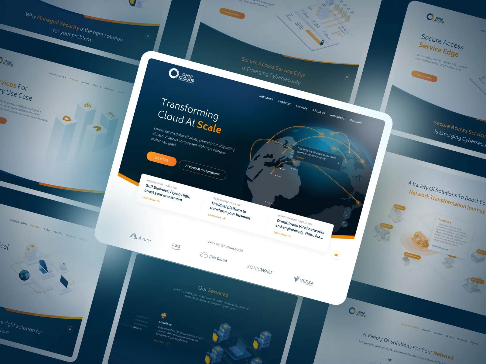
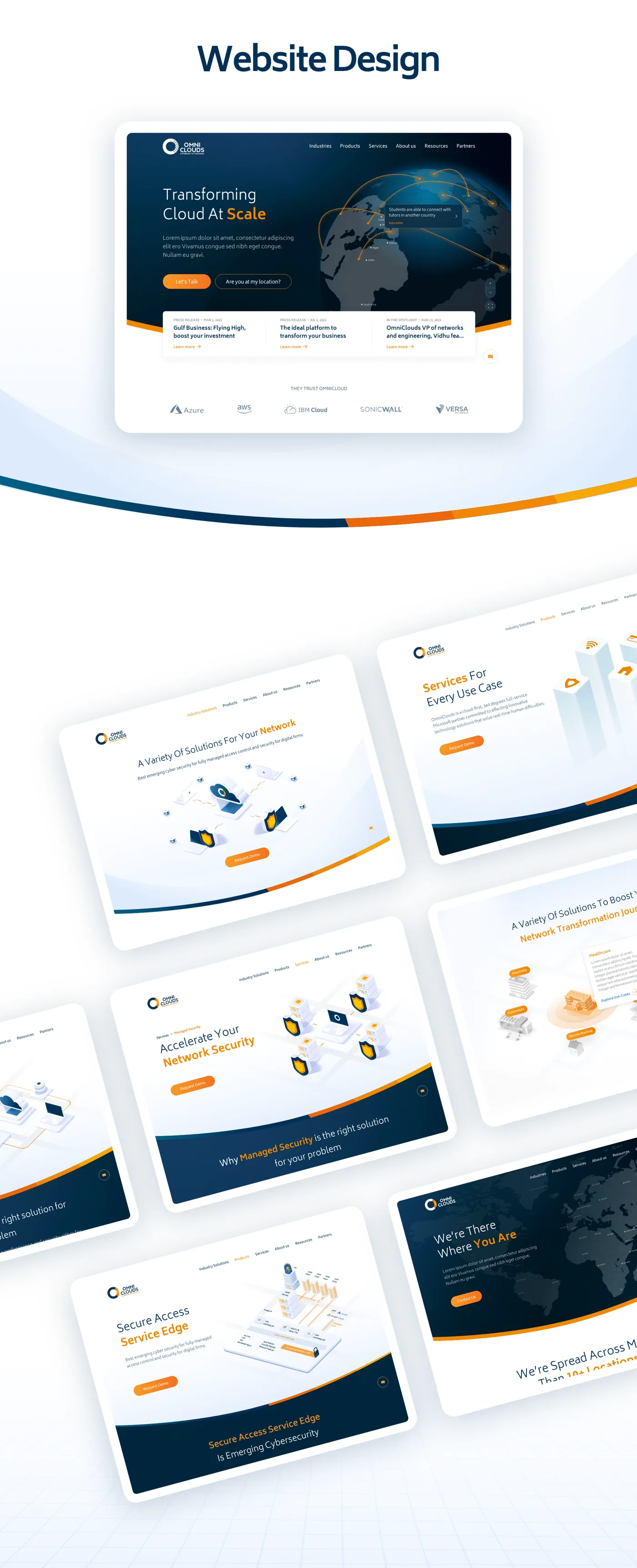
The pages. Home, services, products, industries — each assembled on the grid, each leading with the claim and then the illustration that makes it concrete.
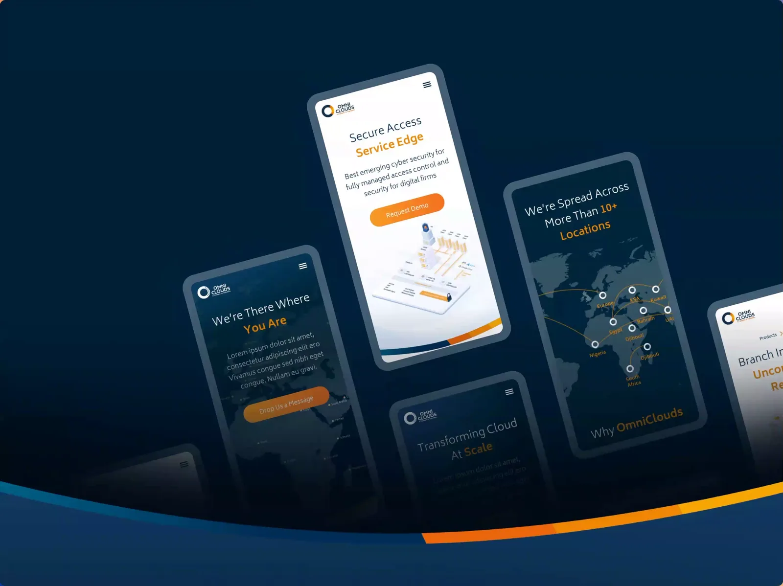
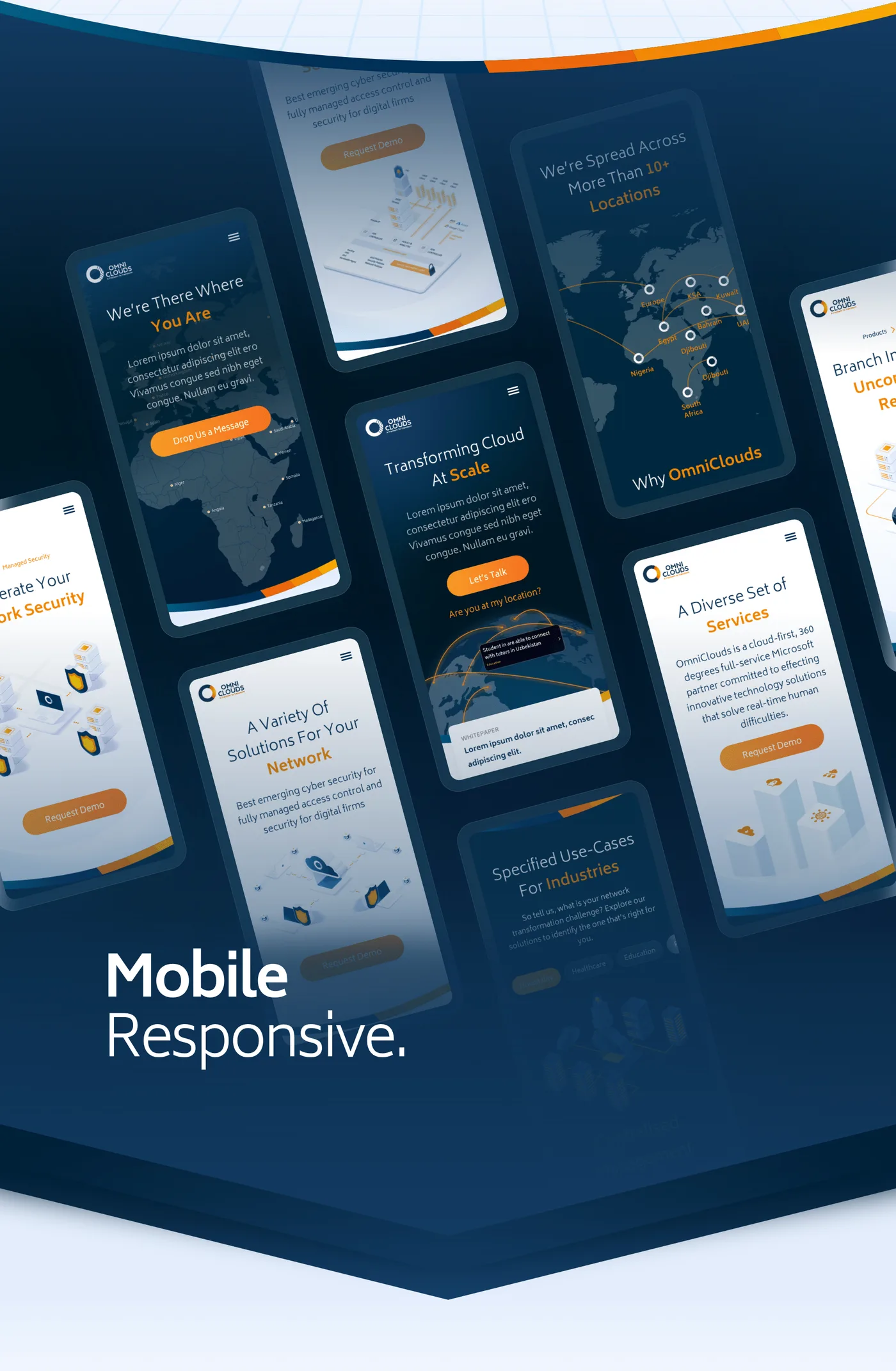
Mobile is not an afterthought here. The same content, re-flowed to one column, with the illustrations re-composed rather than merely scaled — an isometric scene shrunk to 375px reads as noise.

Outcome
OmniClouds got a site that can grow: a sitemap that has room for new services, a grid that makes new pages cheap, a type scale and palette written down, and an illustration system with its own visual grammar rather than a folder of stock.
The part that mattered most was the illustration direction. An enterprise networking company has nothing to show — so we built the thing to show, and made it move.
Traffic and conversion figures for the re-design belong to OmniClouds.
Reflection
The Lottie work was the right idea carried slightly too far. Several scenes animate on scroll, and on a mid-range laptop with a full page of them the effect is less impressive than it is in isolation. I would pick three moments and let the rest hold still.
I would also push harder on the words. I designed a structure that explains a hard product well, and then filled it with copy written by people who already understood the product. Those are not the same audience.