Taleemabad
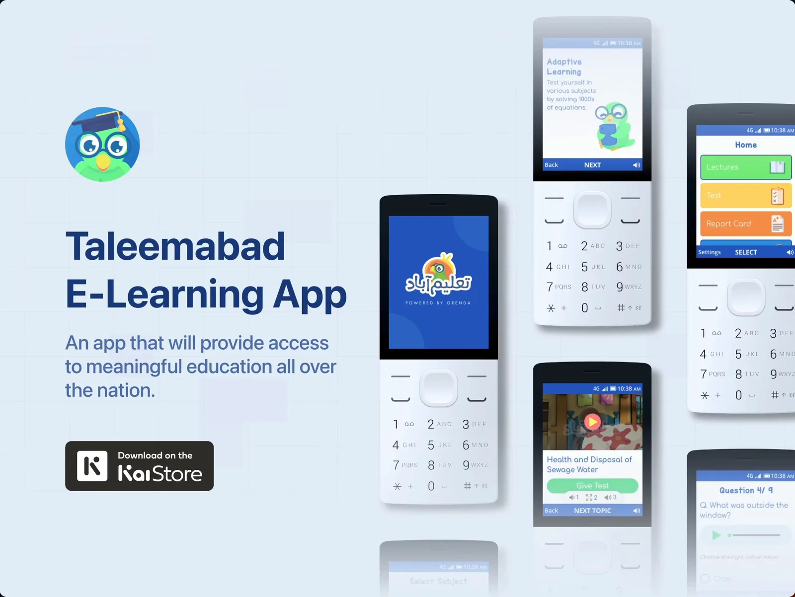
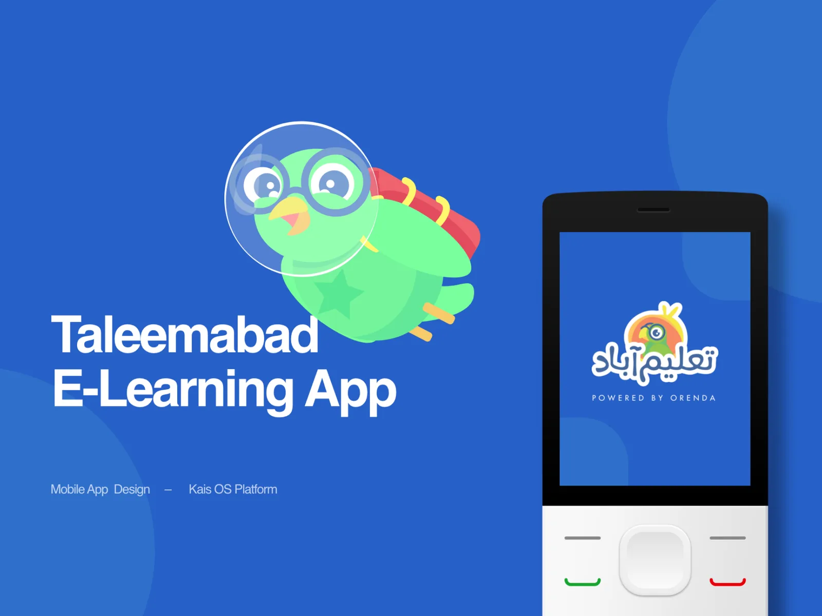
The national curriculum on a ₨2,000 feature phone — an e-learning app designed for KaiOS, a D-pad and no touchscreen.
At a glance
- role
- Research, UX & UI, design system
- client
- Taleemabad · Orenda Project
- year
- 2021
- duration
- Four months
- platform
- KaiOS feature phones
- shipped
- On the KaiStore
Context
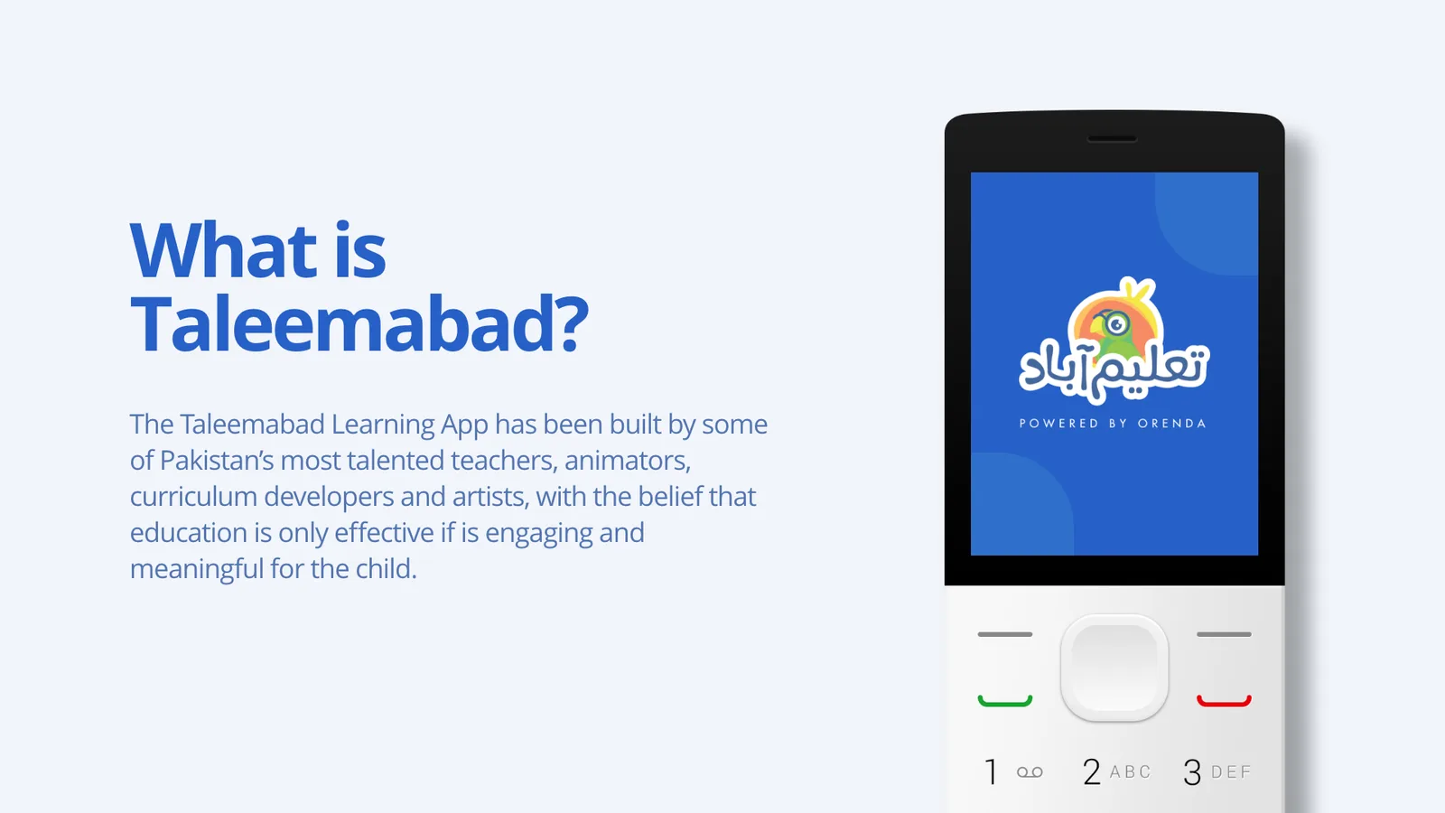
The Taleemabad Learning App was built by some of Pakistan’s most talented teachers, animators, curriculum developers and artists, on the belief that education only works if it is engaging and meaningful for the child.
It already existed on smartphones. The problem was who that left out.
Taleemabad and KaiOS partnered to reach the marginalised, under-resourced communities where a smartphone is not a given — but a feature phone often is. KaiOS runs on low-spec hardware using open web technologies, which makes a real app possible on a device most people would call a dumbphone.
Problem
Smartphones aren’t always accessible. Education should be.
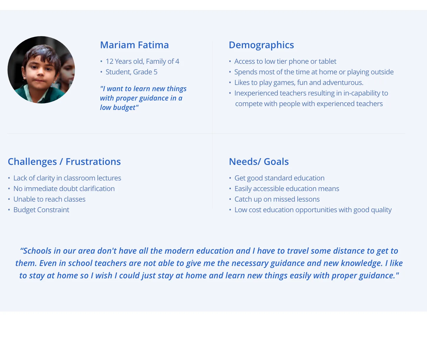
I ran research with students in the target communities and built a persona from it. Mariam is twelve, in Grade 5, one of a family of four, with access to a low-tier phone or tablet. She likes games. She is adventurous. And she is being taught by teachers who cannot always give her what she needs.
Schools in our area don’t have all the modern education and I have to travel some distance to get to them. Even in school teachers are not able to give me the necessary guidance and new knowledge. I like to stay at home so I wish I could just stay at home and learn new things easily with proper guidance.
Mariam Fatima, 12, Grade 5
What she was up against
- Lack of clarity in classroom lectures
- No immediate doubt clarification — a question asked today gets answered next week, or never
- Unable to reach classes at all on some days
- Budget constraint, in every direction
Process
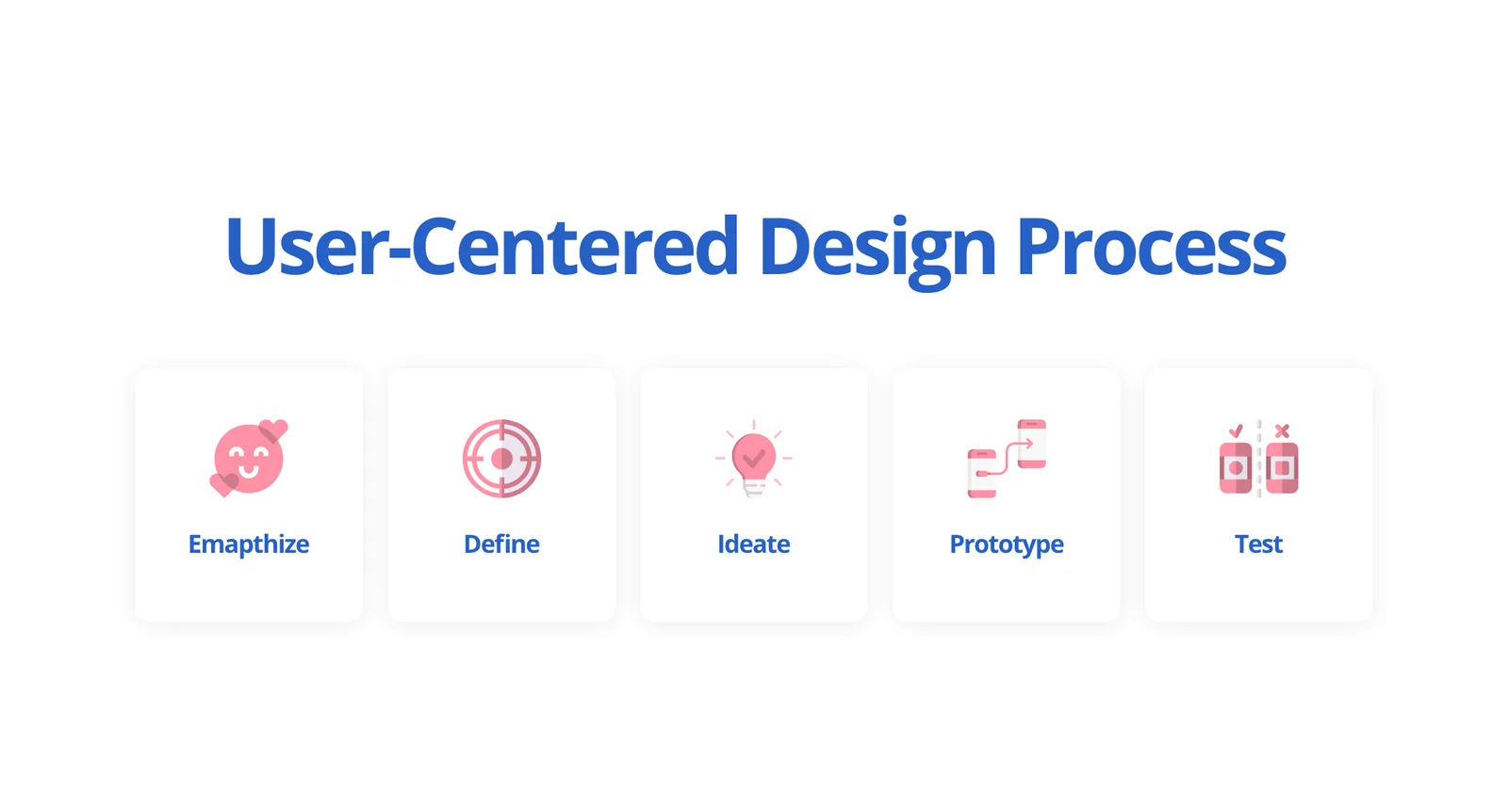
I ran a straight user-centred process — empathise, define, ideate, prototype, test — because the constraint here was so unusual that intuition was worth very little.
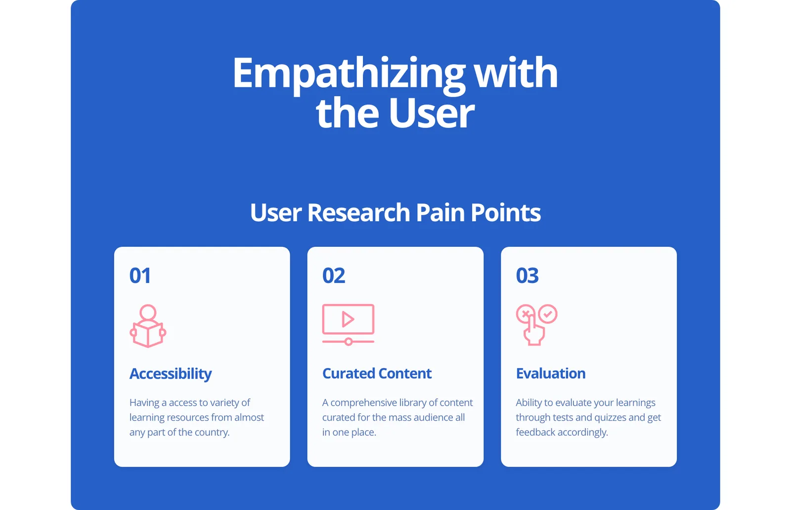
Research narrowed the whole product to three pain points, and everything after that had to serve one of them.
- Accessibility → access to a variety of learning resources from almost any part of the country
- Curated content → a comprehensive library for a mass audience, all in one place
- Evaluation → the ability to test what you have learned and get feedback on it
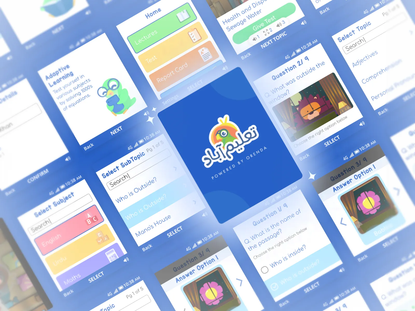
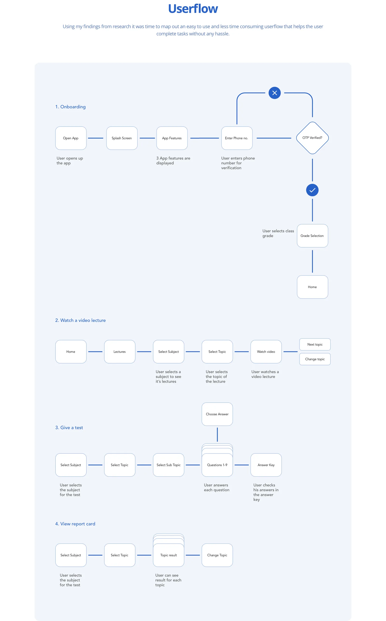
The flows came before the screens, and they had to. A KaiOS phone has a D-pad and soft keys. There is no touch, no gesture, no off-screen menu — every journey has to be walkable with up, down, left, right and select, and every screen has to say what the two soft keys do.
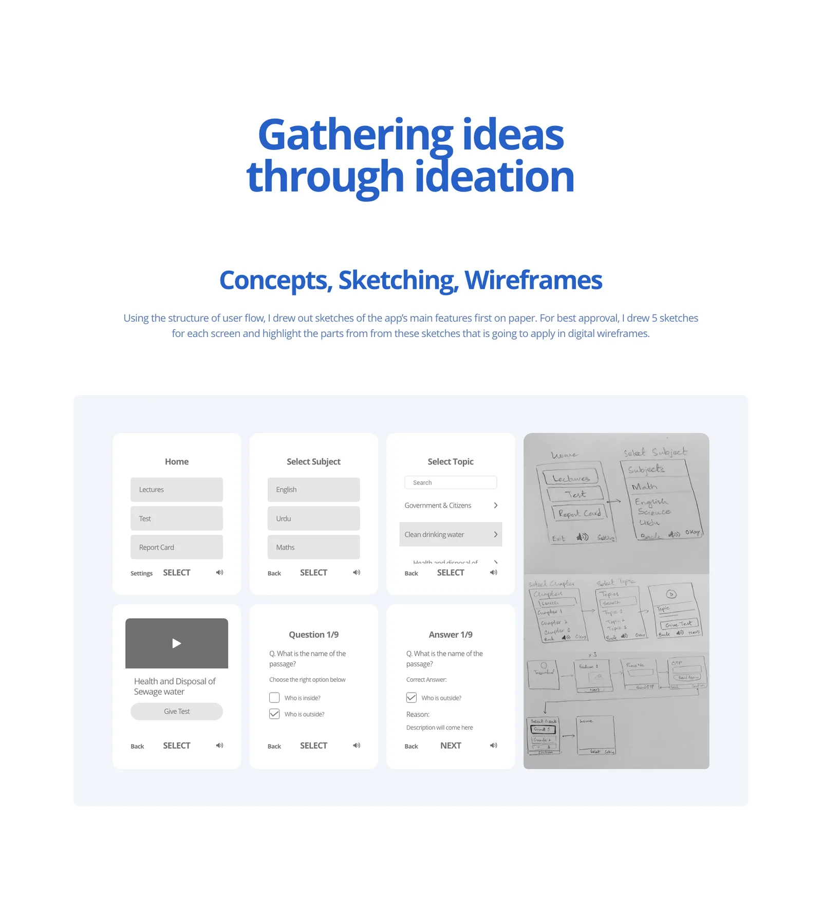
Solution
Three features, one per pain point, each built to be reached with a thumb on a D-pad.
Watch a video lecture. The curriculum, delivered by the animators and teachers who made it, playing on a phone that was never designed for video — reached in the fewest key presses I could get it down to.
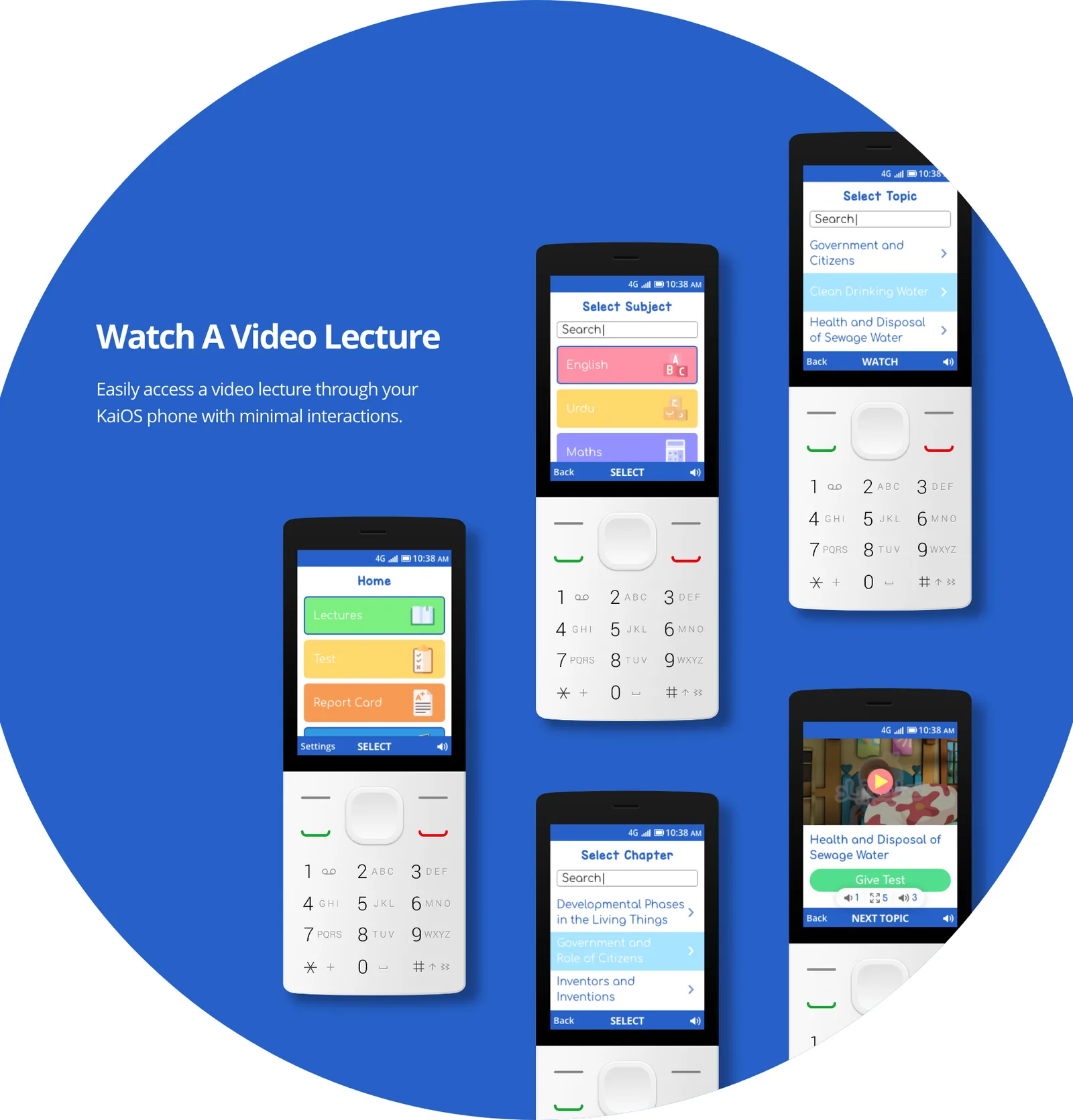
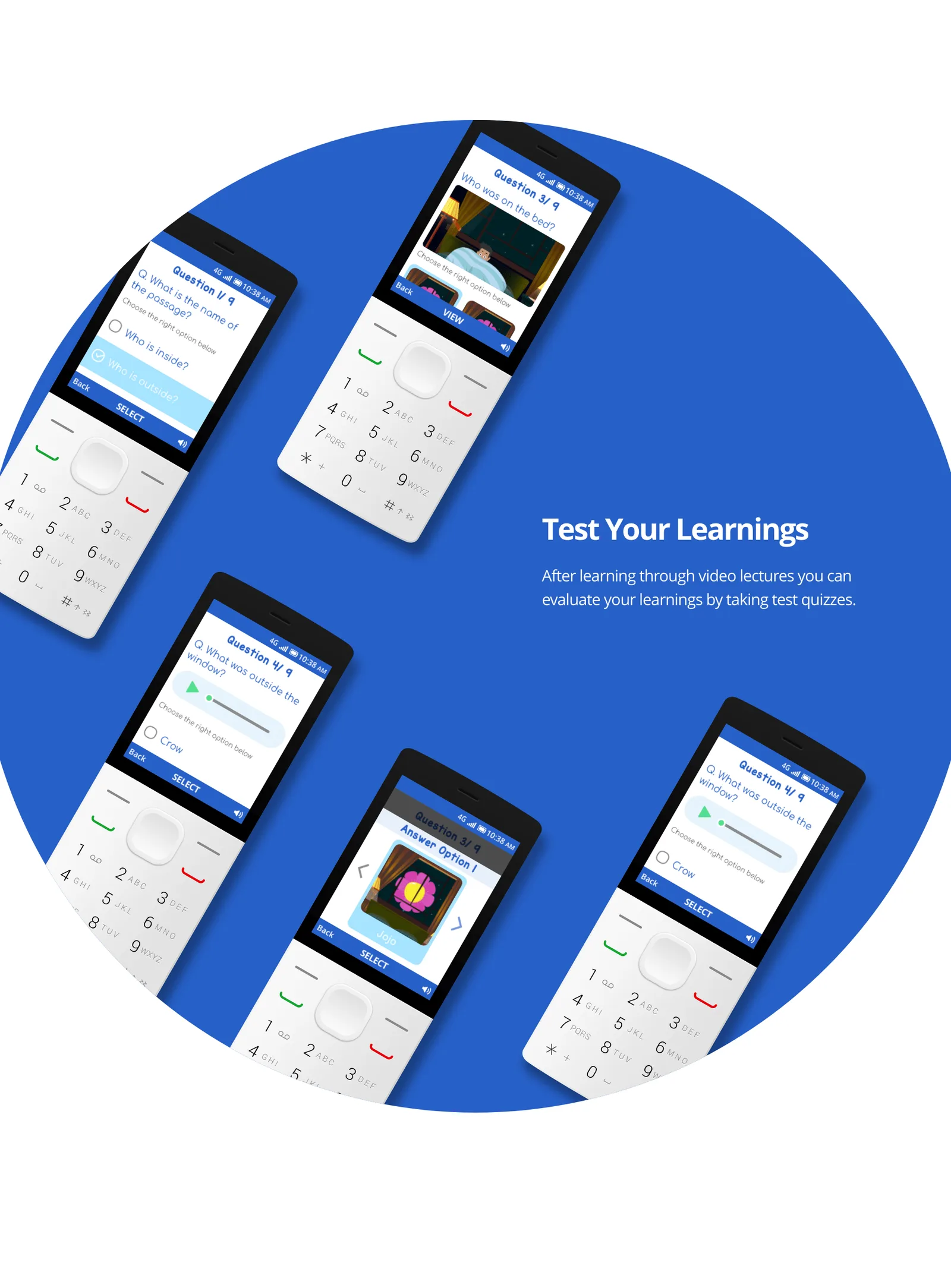
Test your learnings. Watching is not learning. A quiz after each lecture lets a child check herself without a teacher in the room.
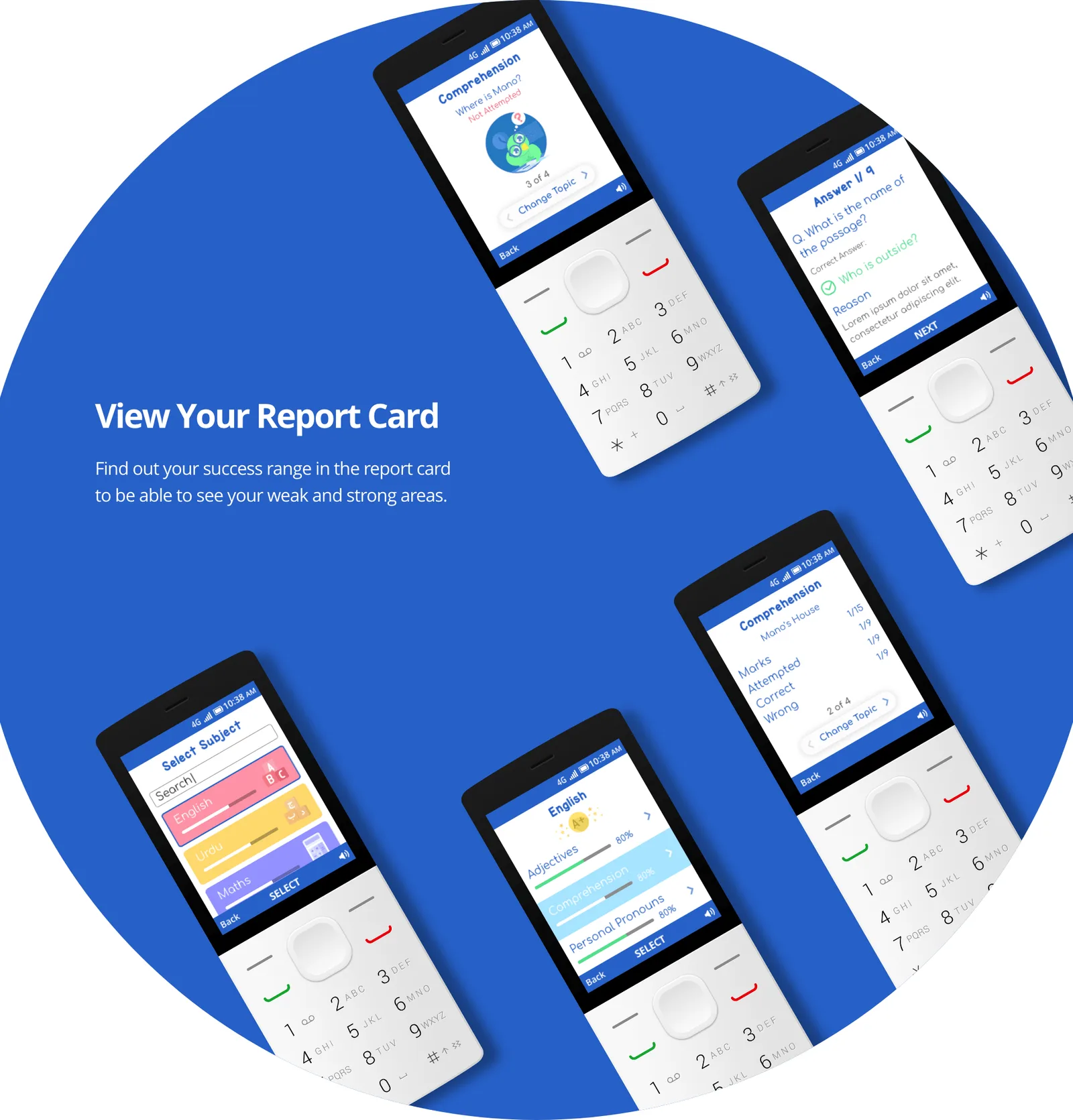
View your report card. The evaluation pain point, closed: a success range that shows where she is strong and where she is weak — the feedback her classroom could not reliably give her.
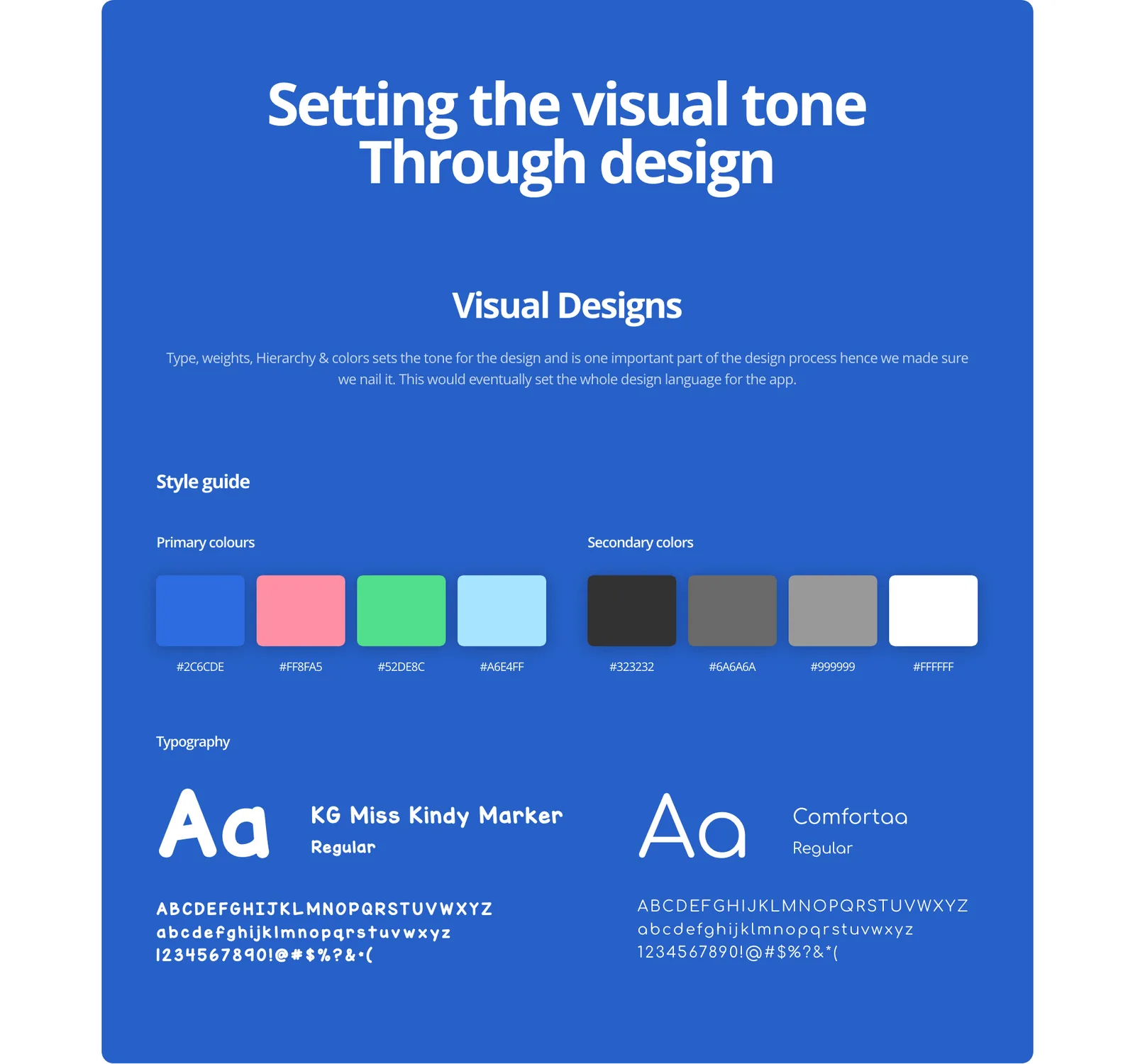
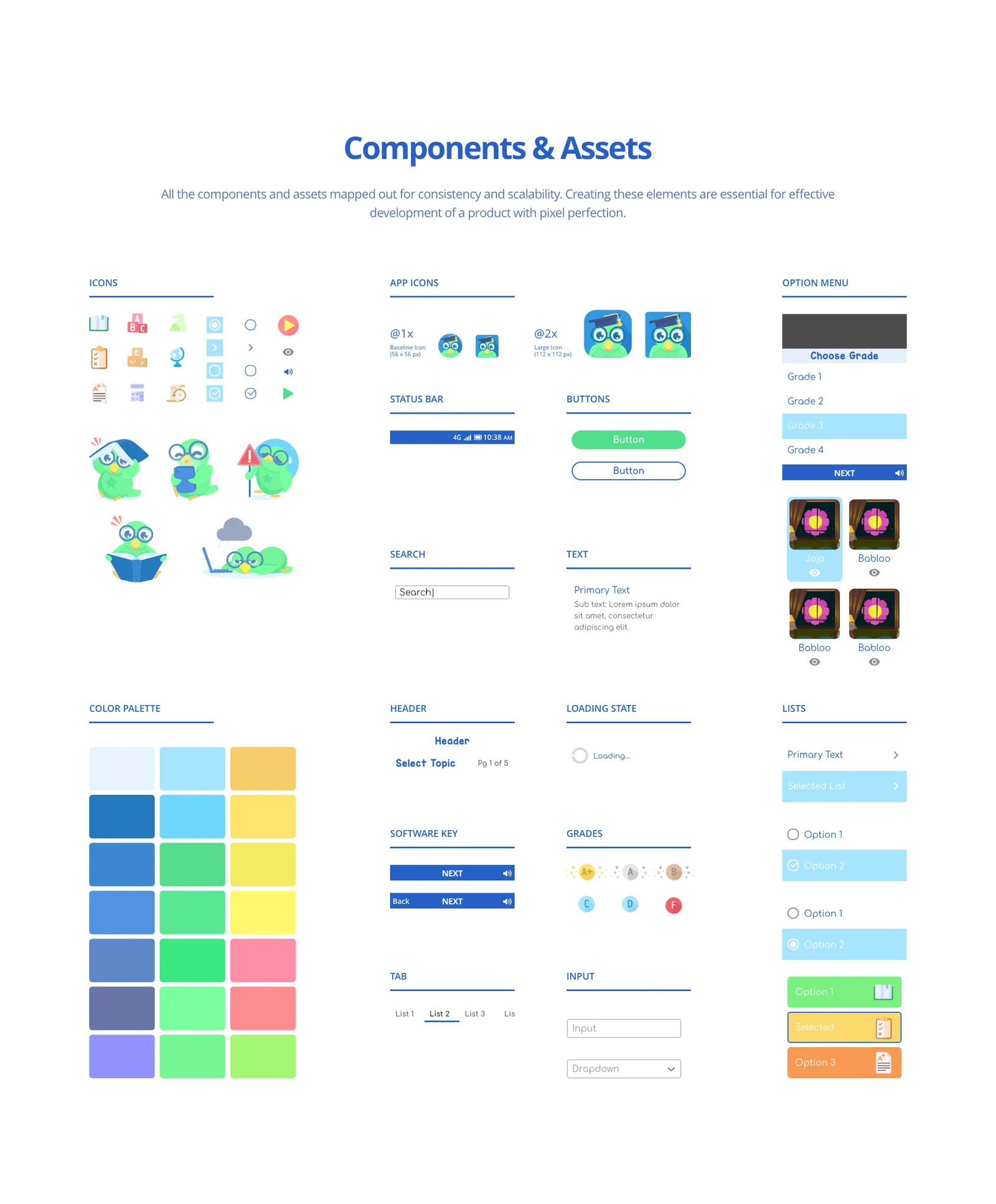
A design system for a 240-pixel screen. Two typefaces — KG Miss Kindy Marker for warmth, Comfortaa for reading — a primary palette bright enough for cheap screens, and a component library sized for a display smaller than most app icons.
Outcome
The app shipped to the KaiStore. In classrooms, and in homes — on the basic phones that a smartphone-first product had written off.
What it proves is narrow and I think worth saying plainly: the constraint was the brief. A D-pad, a tiny screen and a low-spec chip did not produce a worse product, they produced a more decided one. Every screen had to earn its place because there was no room for anything that did not.
Adoption figures for the KaiOS release are Taleemabad’s to publish, not mine.
Reflection
I would test on the hardware sooner. I designed against KaiOS specifications and mock-ups for longer than I should have, and a real device teaches you things a spec sheet does not — how slow a screen redraws, how a colour behaves on a cheap panel, how long a thumb takes to cross a menu.
I would also design the offline story properly. Connectivity in the communities this was built for is not reliable, and I treated download and playback as an engineering concern when it was a design one.