Cloudnosys
Cloud security and compliance across AWS, Azure and GCP — dashboards, onboarding, automated remediation and a resource visualiser.
At a glance
- role
- Product designer
- company
- Cloudnosys
- years
- 2019 – 2021
- platform
- Web application
- clouds
- AWS, Azure, GCP
- scope
- Research, flows, UI, design system
Context
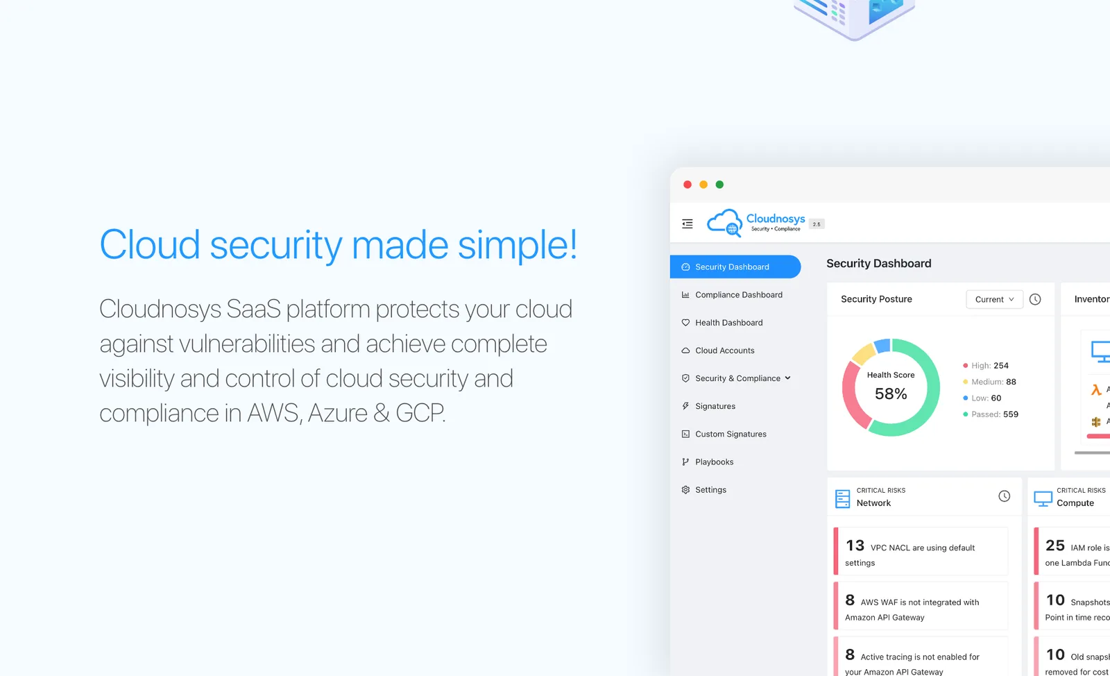
Cloudnosys is a SaaS platform that protects your cloud against vulnerabilities and gives you complete visibility and control of security and compliance across AWS, Azure and GCP.
I spent two years on it as the product designer. It is the longest I have lived inside one product, and it is where I learned that enterprise software is not a design problem about screens — it is a design problem about volume. A mid-size company’s cloud generates more findings in a day than a person can read in a week.
Problem
Most teams dream of clarity in cloud security. Very little software delivers it.
What makes this category hard
- The data is enormous, and almost all of it is fine — the interface has to surface the small part that is not
- Three clouds, three vocabularies, one product that has to speak all of them
- Getting started means handing over permissions to your infrastructure, which is the least trusting moment in the whole relationship
- Finding a problem is not fixing it, and the gap between the two is where security teams drown
- Nothing in a resource list tells you what a resource is connected to — and the connection is usually the vulnerability
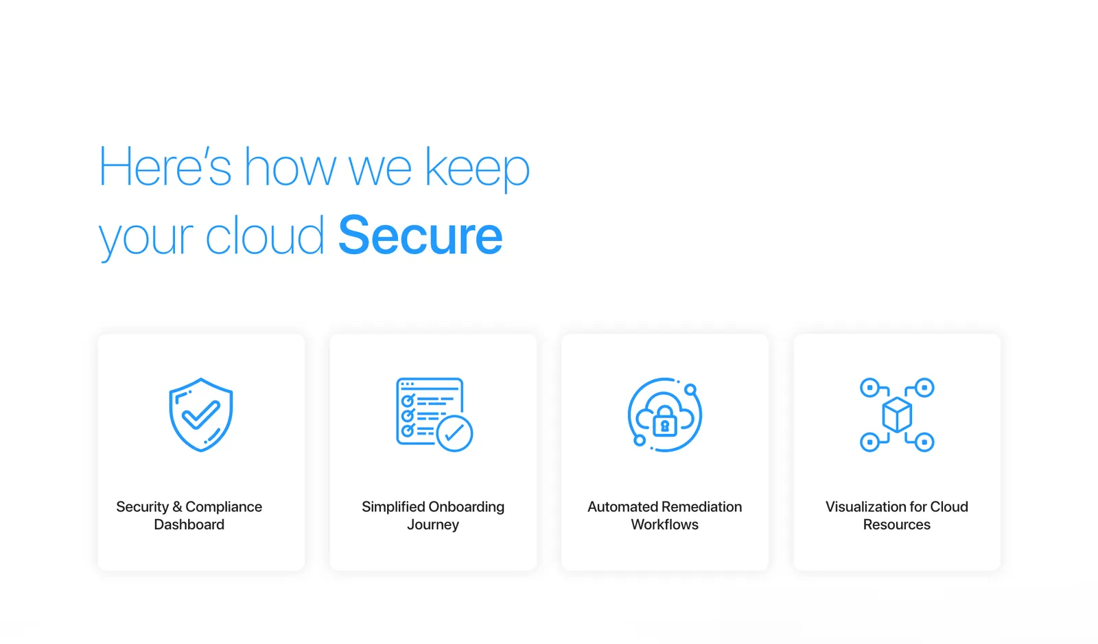
Each of those became a pillar of the product.
Process
Two years in one product changes how you work. There was no big reveal — there was a rhythm.
- Researched the domain and the top competitors, because in security you are designing against a category convention as much as against a user need →
- Mapped the insights with affinity diagrams, so the patterns came from the data rather than from whoever spoke loudest
- Designed the user flows and the core journeys before any interface existed
- Worked from low-fidelity wireframes up to polished UI, in that order, every time
- Synced daily with the engineers, so a handoff was a conversation already in progress rather than an event
That last one is the reason this product shipped as designed. Daily contact with the people building it meant the design was constrained by what was actually possible before it was drawn, not after it was rejected.
Solution
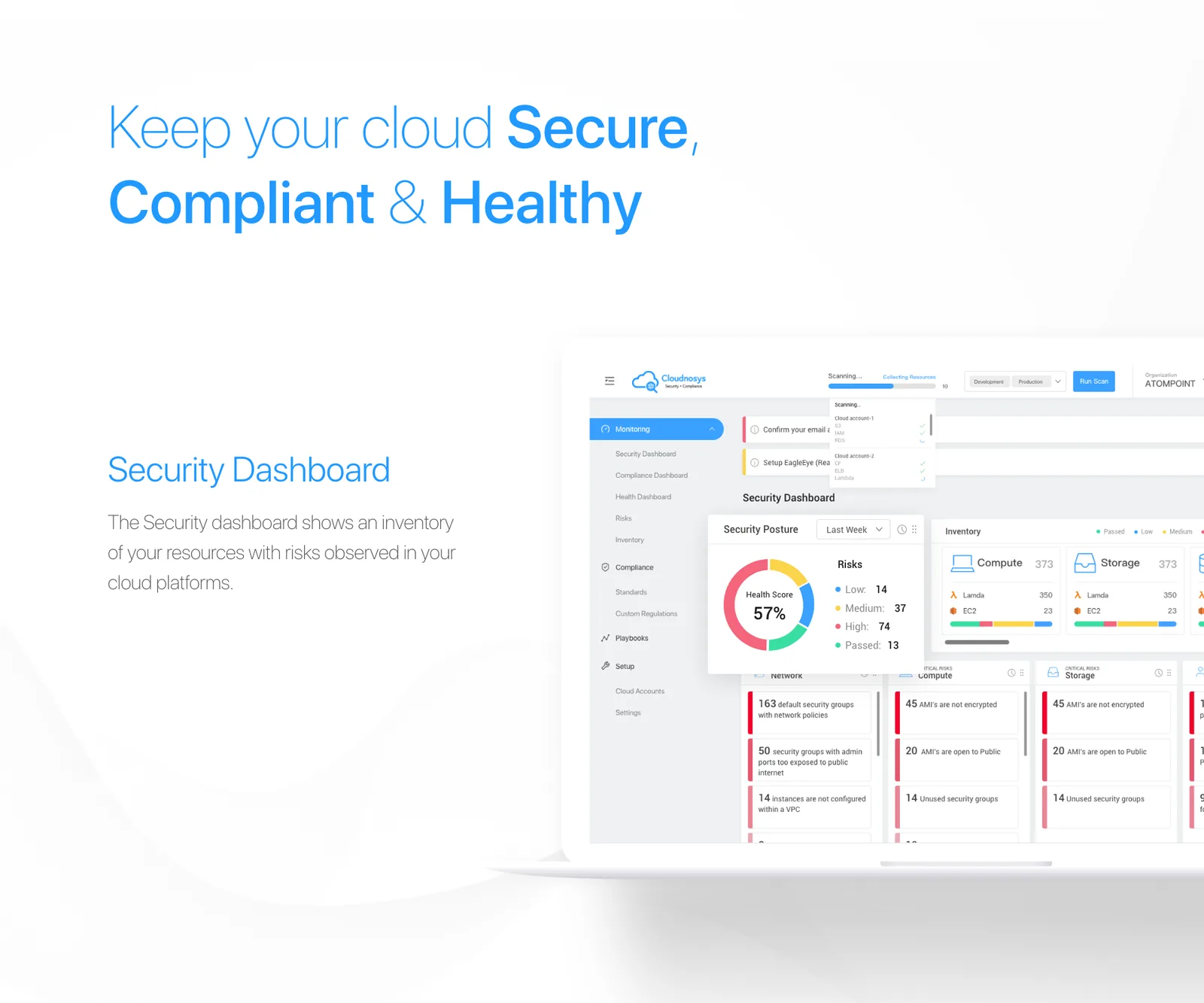
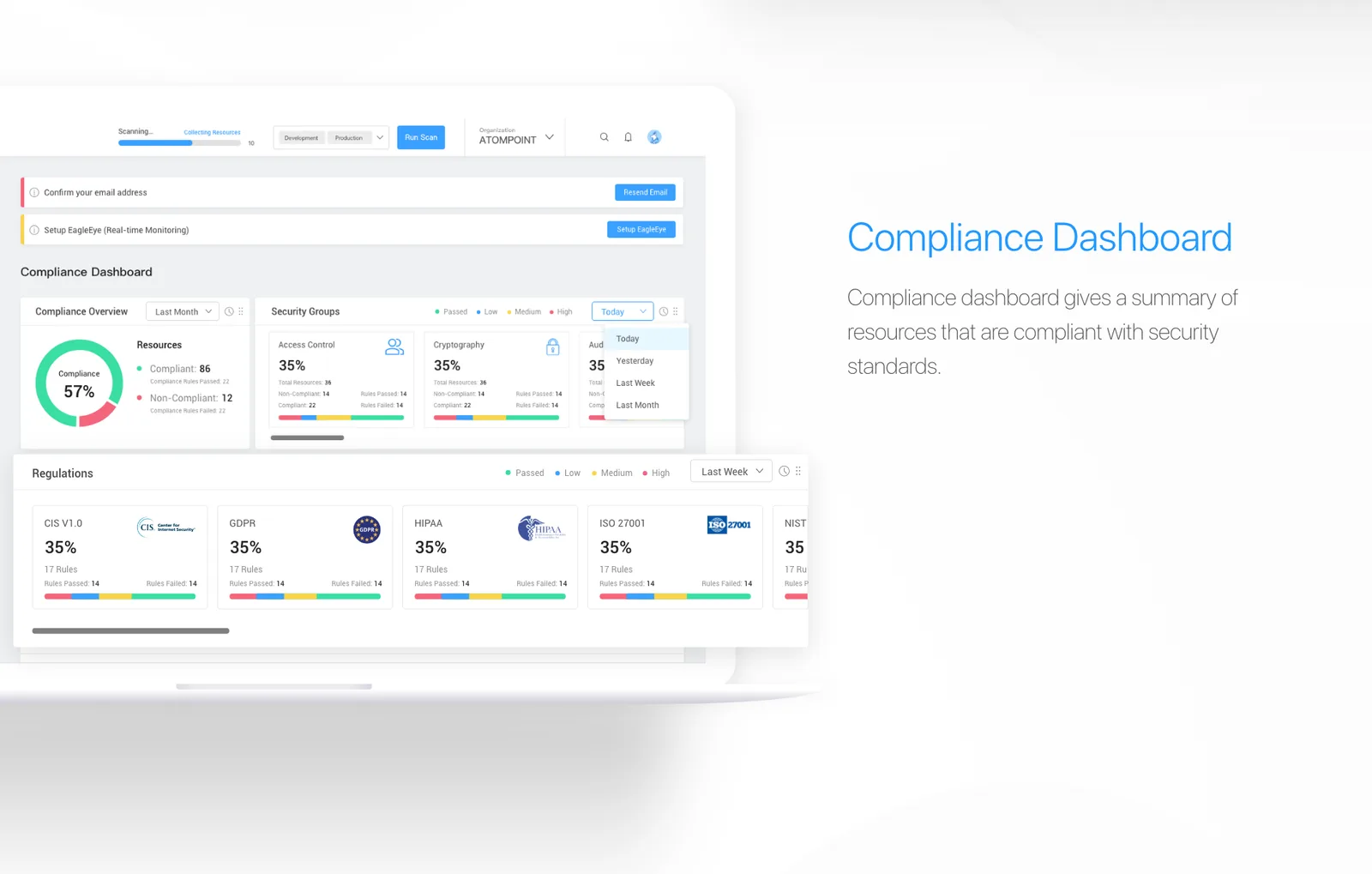
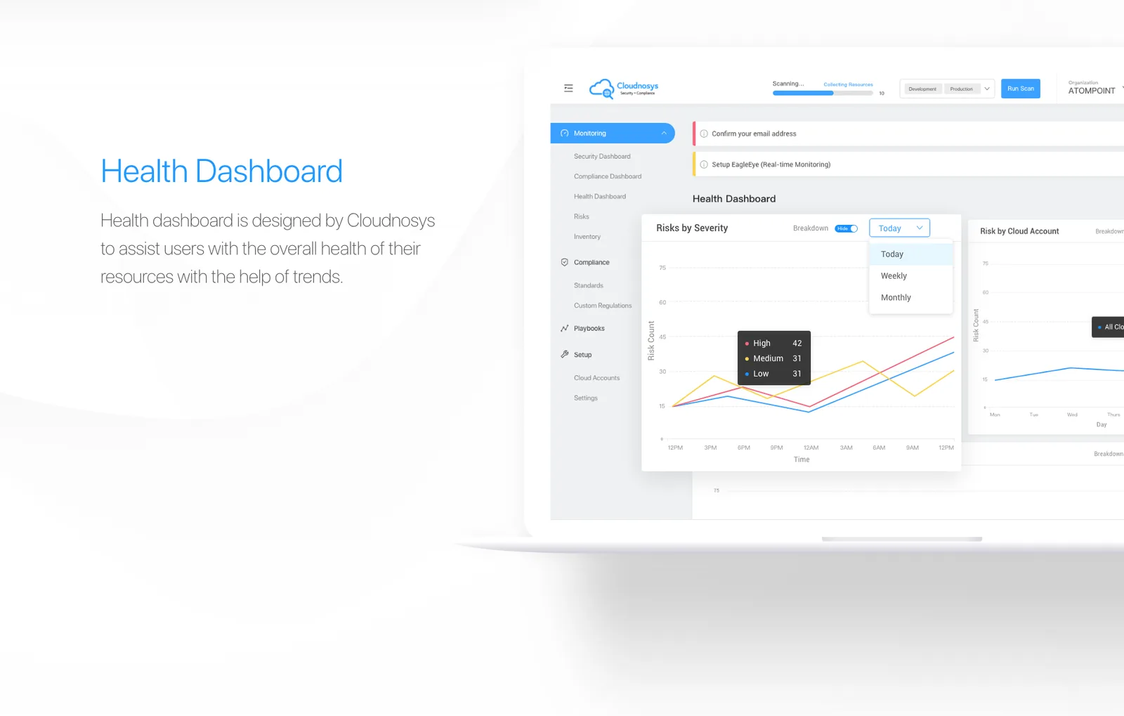
Dashboards that answer one question each. Rather than one screen trying to be everything, three: Security shows the inventory of resources and their state; Compliance summarises what does and does not meet each standard; Health scores the overall condition of the cloud at a glance.
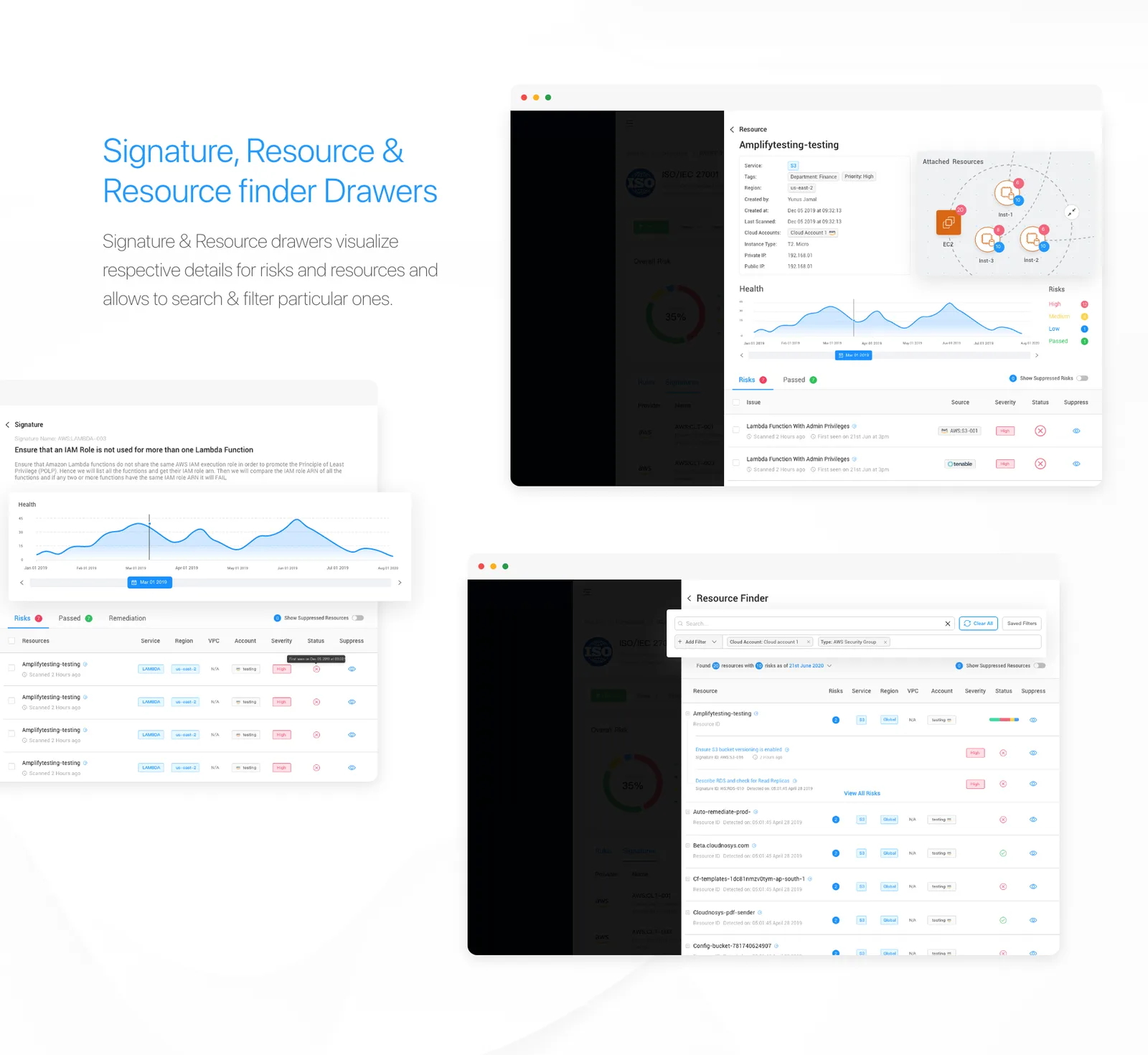
Behind them, drawers. Signature, resource and resource-finder panels slide over the dashboard so an investigation never costs you your place — you can search, filter and read the detail of one finding without losing the view you were reading it against.
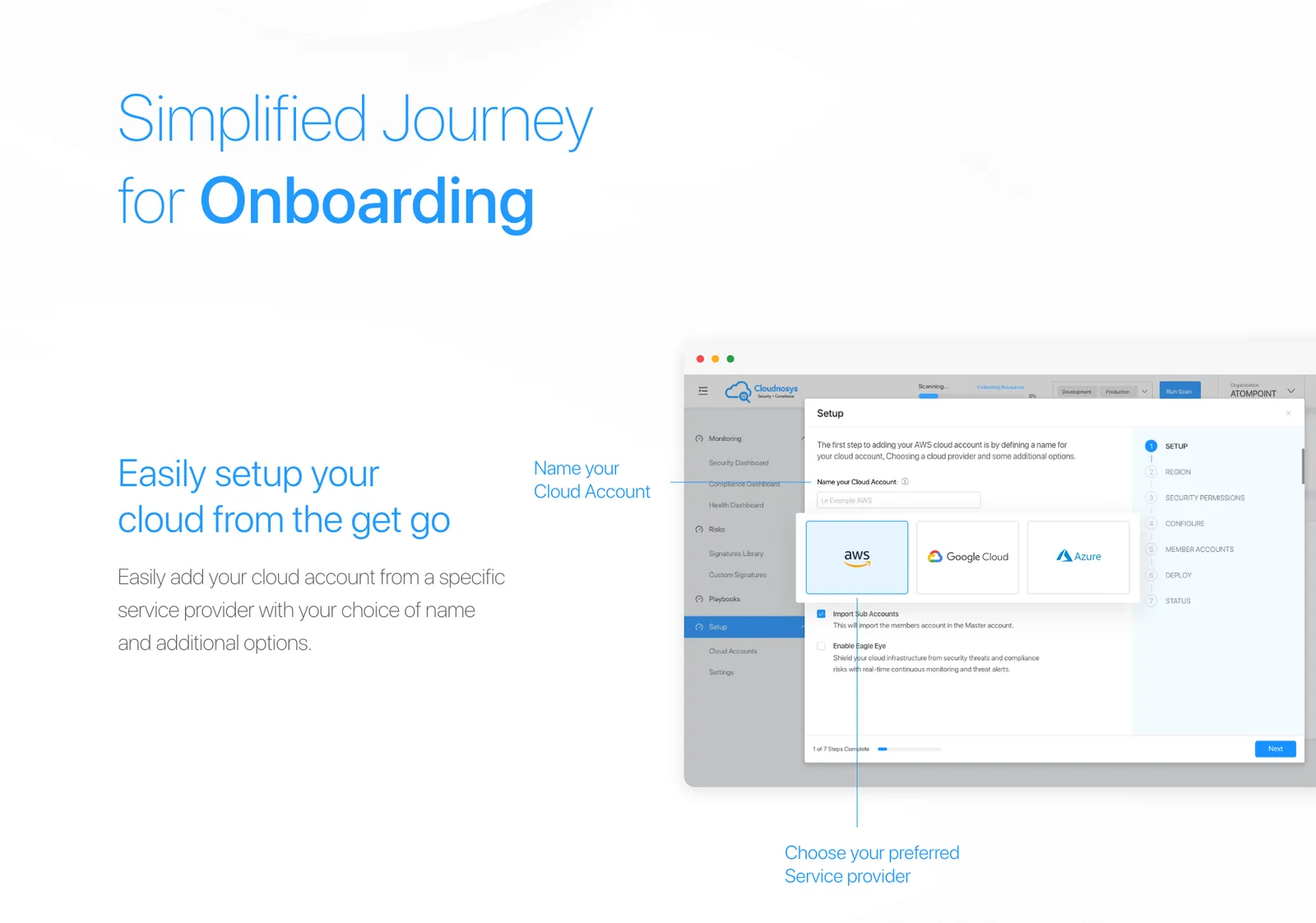
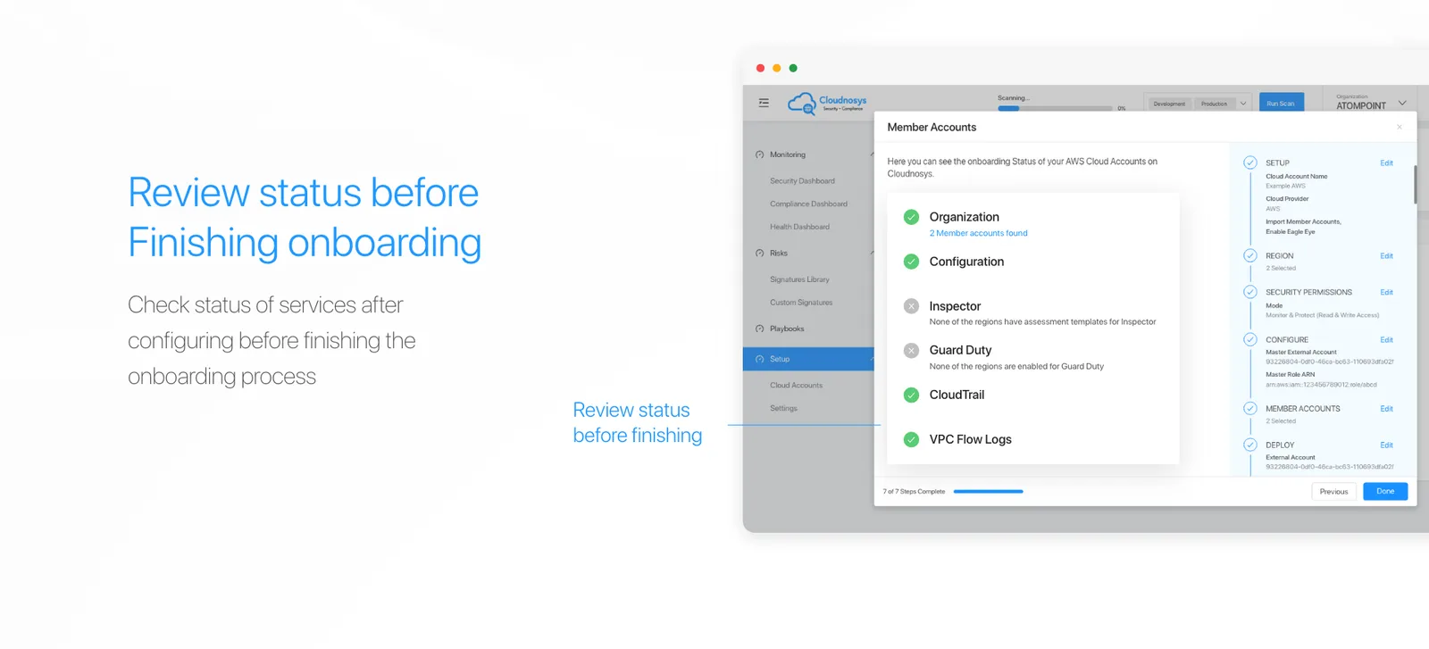
Onboarding, treated as the trust problem it is. Connecting a cloud account means granting a stranger permissions to your infrastructure. So the journey shows its own progress, states plainly what each permission is for and whether it is read-only or read-and-write, and ends with a review of everything you have agreed to before anything is finished.

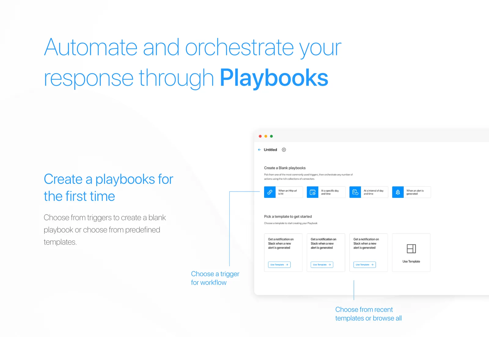
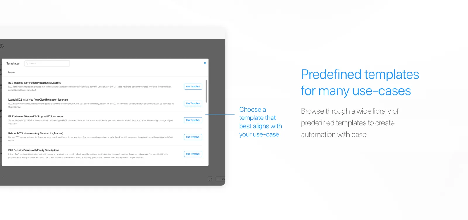
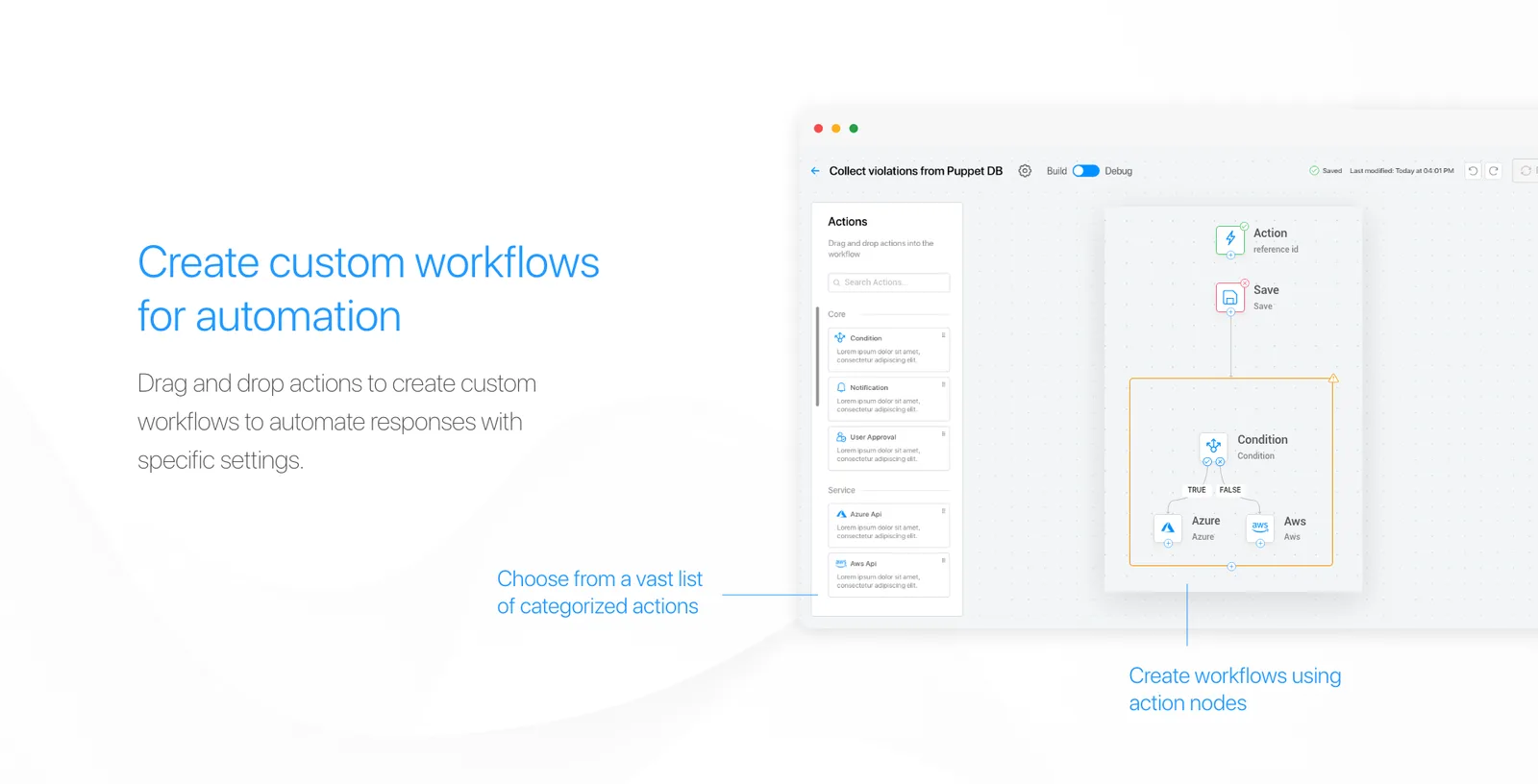
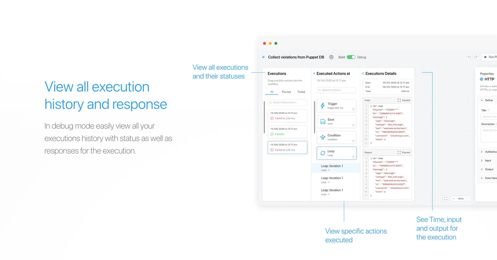
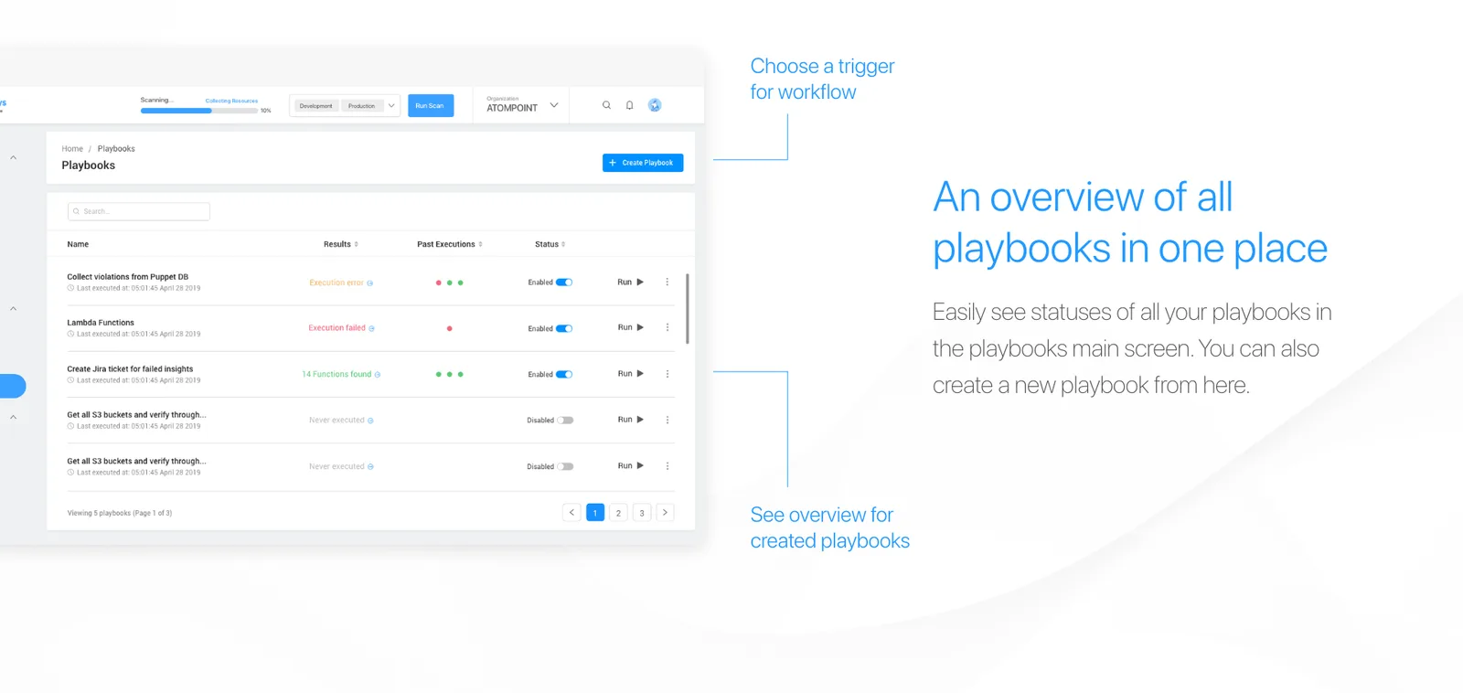
Playbooks — the gap between finding and fixing. Automated remediation, built as something a security engineer can compose: predefined templates for common cases, custom workflows by drag and drop, configurable properties per action, version history with rollback, and the full execution history of what ran and what it returned.
Automation that you cannot audit is not automation, it is a liability. Execution history and rollback were not features requested by users — they were the price of asking a security team to let software act on their infrastructure.
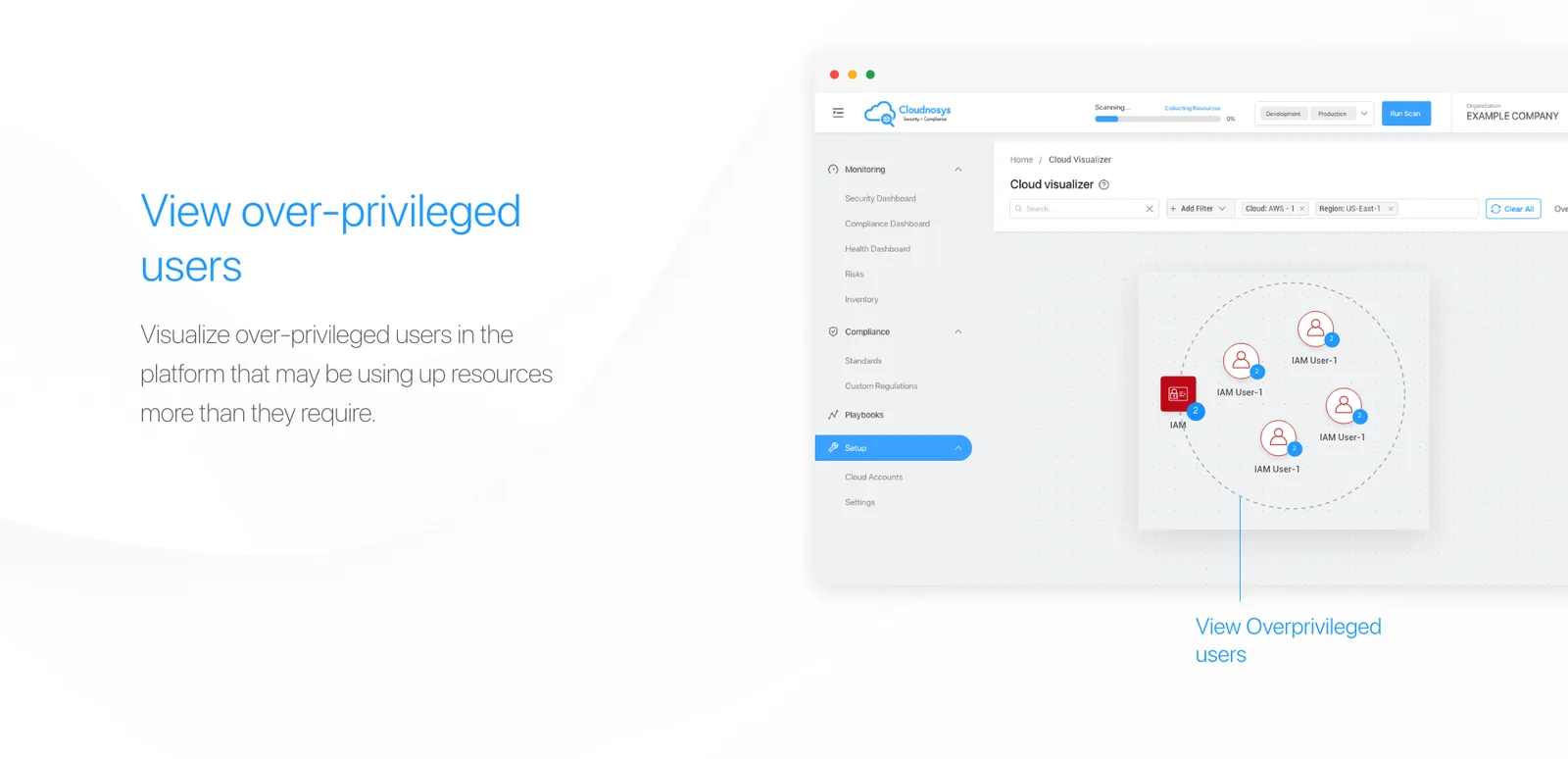
Cloud Visualizer — the answer to the hardest one. A list tells you a resource is misconfigured. A graph tells you it is misconfigured and attached to your production database. The visualiser maps service-to-resource and resource-to-sub-resource relationships, colours them by severity, and lets you filter down to what you are actually investigating.
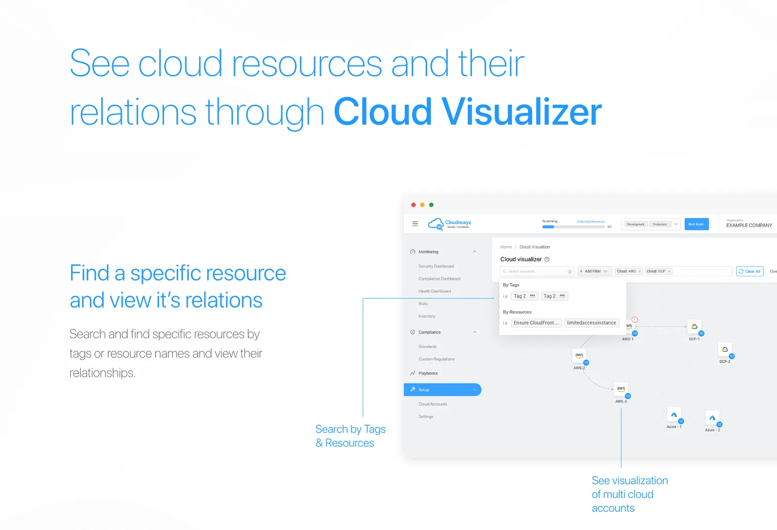
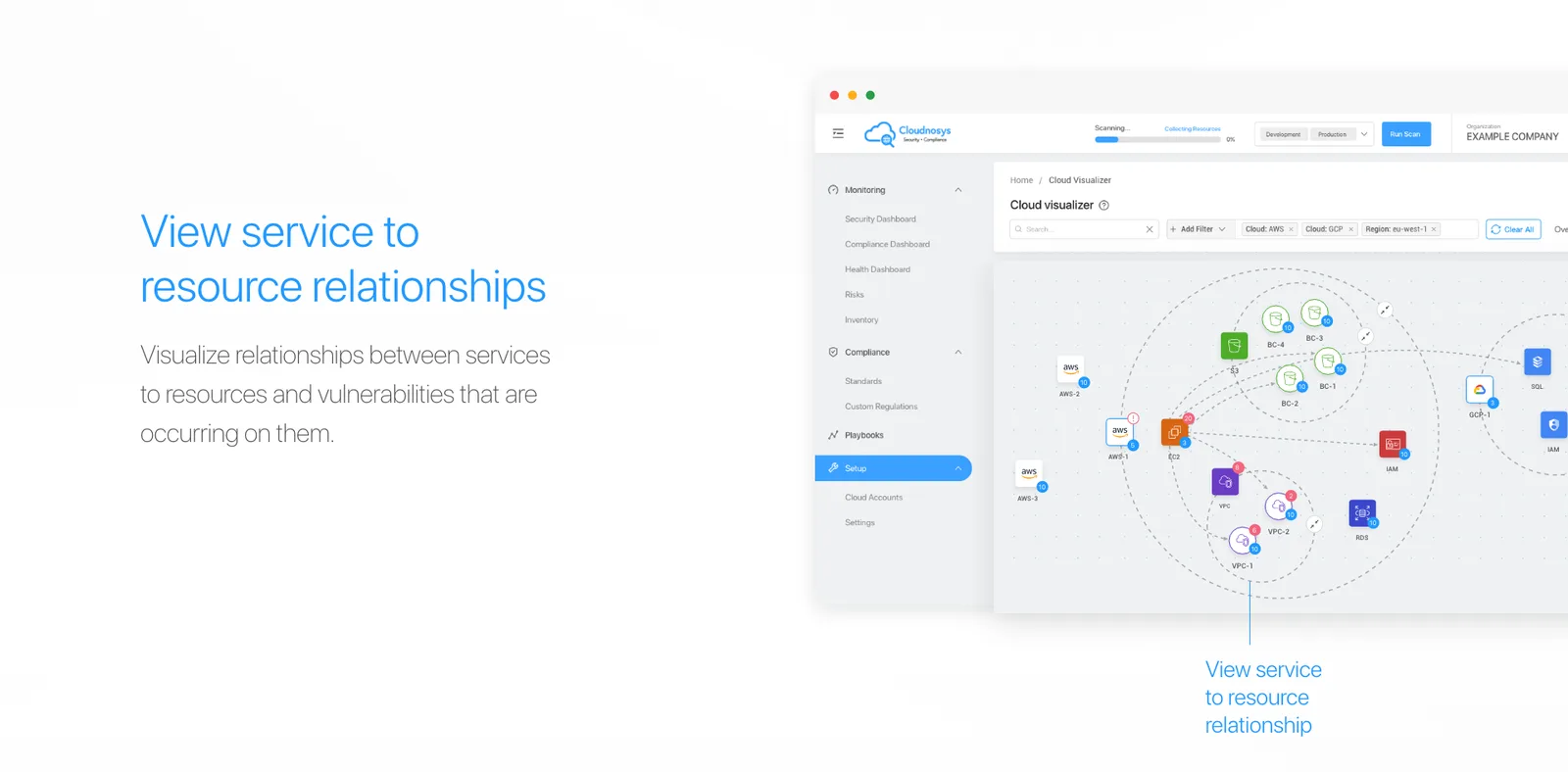
The same graph answers a question security teams ask constantly and could not previously see: who has more access than they need.
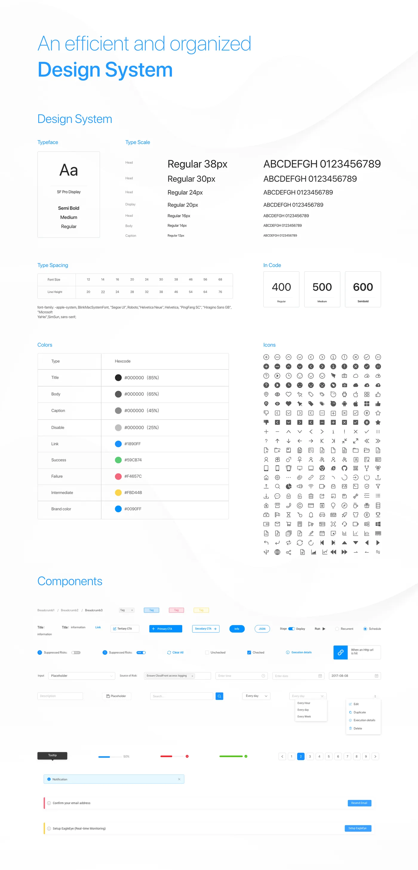
And a design system underneath all of it. Type scale, colour, iconography, form controls, tables, states — an efficient and organised system, because a product this large cannot be held together by one person remembering what things look like.
Outcome
Cloudnosys shipped as a platform that does the whole loop: connect a cloud, see what is wrong, understand what it is connected to, and fix it automatically with a record of what was done.
Two years of daily work with the engineering team is the outcome I would actually point at. The design system, the flows and the journeys survived because they were built alongside the build rather than thrown over a wall at it — and the product still reflects them.
Customer and revenue figures belong to Cloudnosys.
Reflection
I designed a lot of surface. Four pillars, dozens of screens, and by the end there were views I could justify individually but not as a set — the Visualizer and the dashboards answer overlapping questions in different visual languages, and a user coming in cold has to learn both.
I would also have pushed for research with security teams under real load. Most of my testing was with people looking at a calm account. The product’s hardest moment is the one where something is actually on fire, and that is the moment I understood least.