Blync
A home-services marketplace for Karachi — one app for certified vendors, fixed prices and appointments you can actually keep.
At a glance
- role
- Research, UX & UI, brand
- company
- Blync
- year
- 2020
- platform
- iOS, Android, web
- scope
- Persona, IA, flows, wireframes, UI, style guide, site
- tools
- Adobe XD, Illustrator, Photoshop
Context
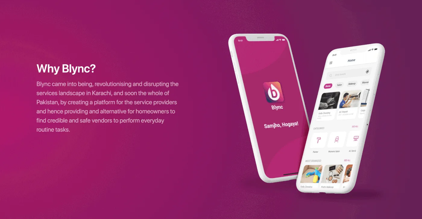
Blync set out to disrupt the services landscape in Karachi, and then the rest of Pakistan, by building a platform for service providers — and, through it, an alternative for homeowners who needed credible, safe vendors for everyday jobs.
Salon visits, AC repair, sofa cleaning, plumbing, electrical work, party makeup. Ordinary household work, arranged through a network that ran on phone numbers passed between neighbours.
Problem
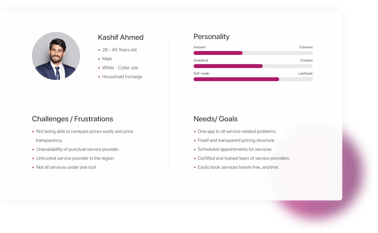
I built one persona from the target audience the client supplied, because a single sharp user is more useful for making decisions than four vague ones.
Kashif is 28 to 45, a white-collar worker, and the person in his household who gets things fixed. His frustrations turned out to be the product brief.
What was actually wrong
- No way to compare prices, and no price transparency at all
- Service providers who did not turn up when they said they would
- No trusted provider in the region — trust ran on personal referral
- No single place that covered every job a house needs
Process
The needs sat opposite the frustrations almost one to one: one app for every service problem, fixed and transparent pricing, scheduled appointments, certified providers, booking without hassle at any hour. That gave me the architecture before I drew a single screen.
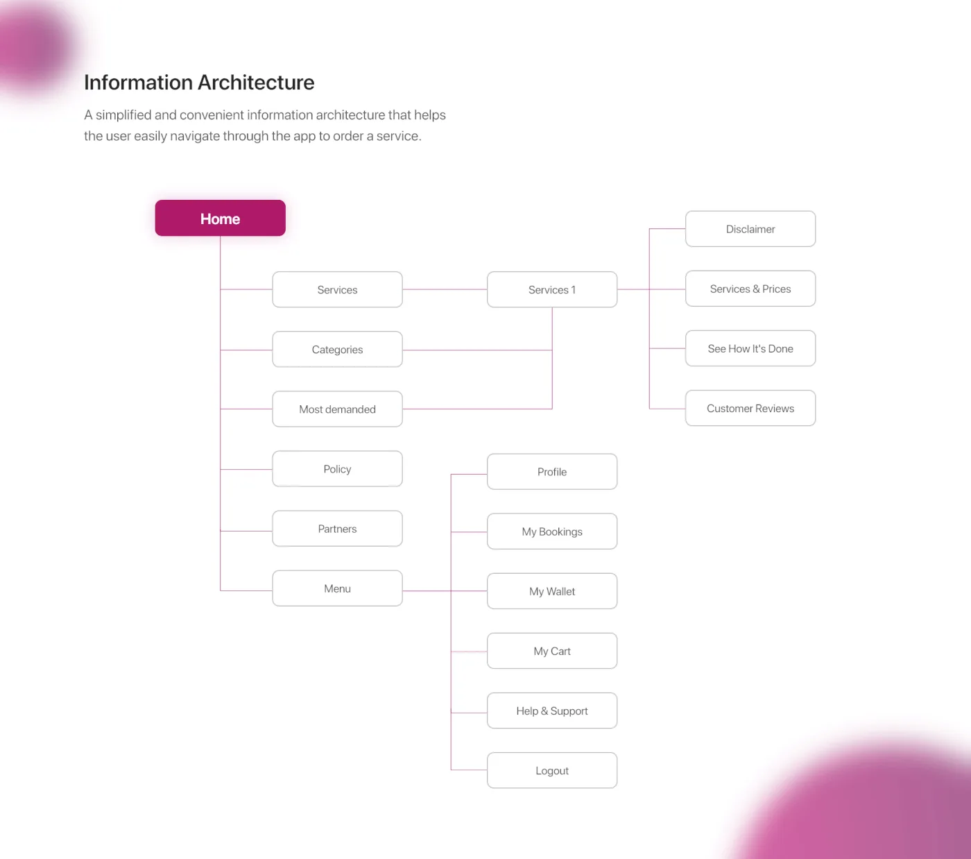
Information architecture. A simplified, convenient structure that lets the user move through the app in order. Home branches to services, categories, bookings and support; each branch ends somewhere a task is finished, not somewhere a menu continues.
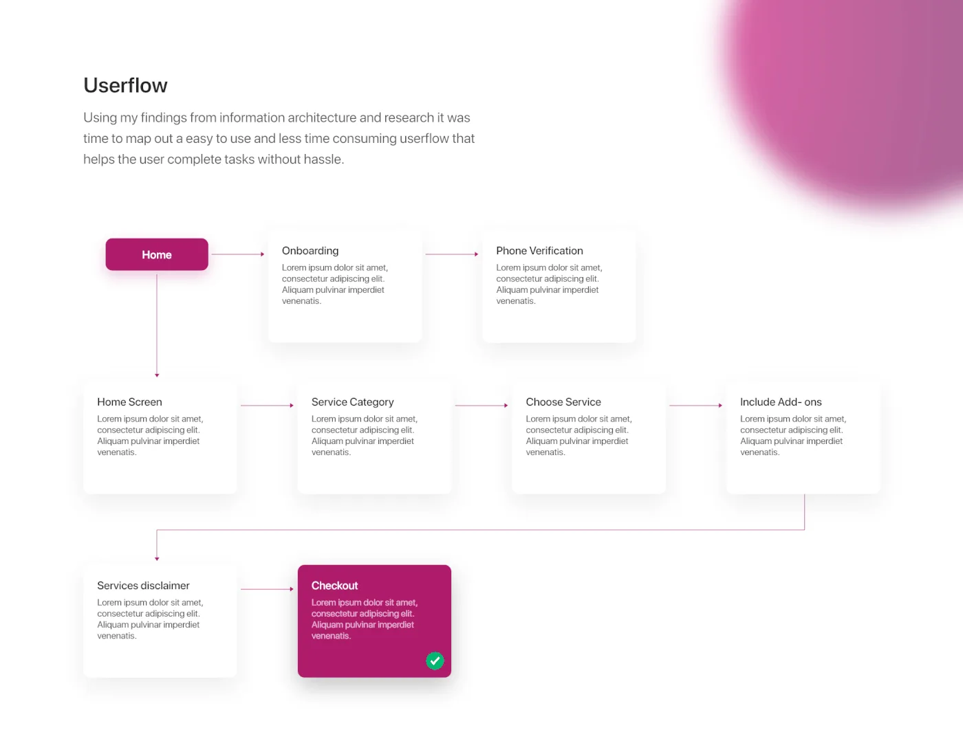
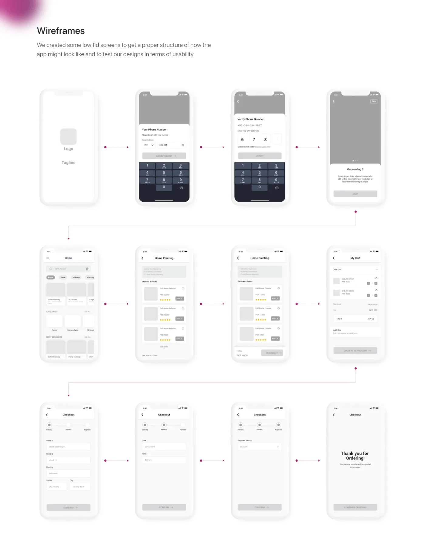
User flow. Built from the IA and the research so the journey could be tested before it was designed: onboarding, phone verification, home screen, service category, choosing a service, the estimate, the checkout.
Wireframes. Low fidelity first, so the argument stayed about sequence and hierarchy rather than colour.
Solution
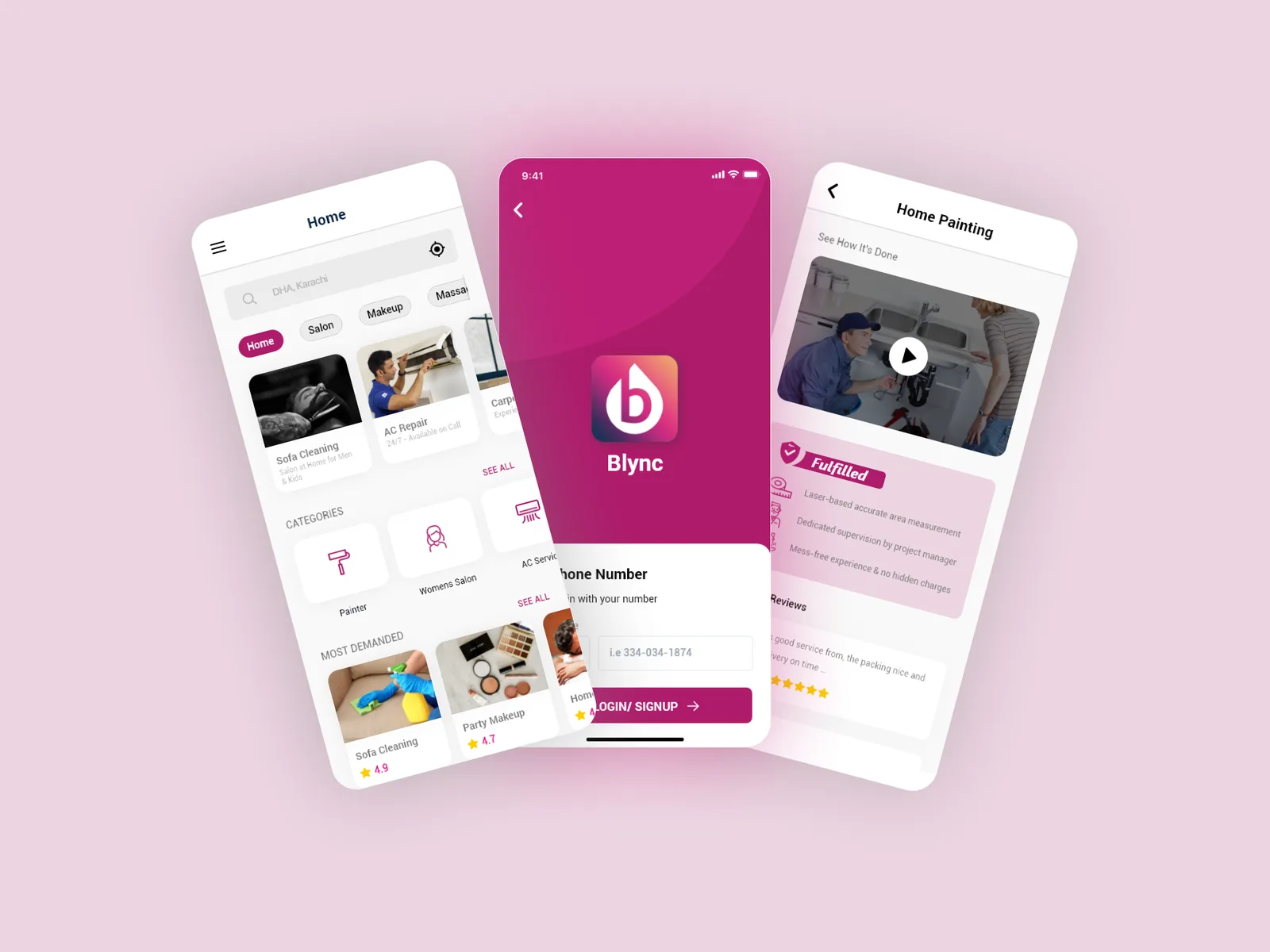
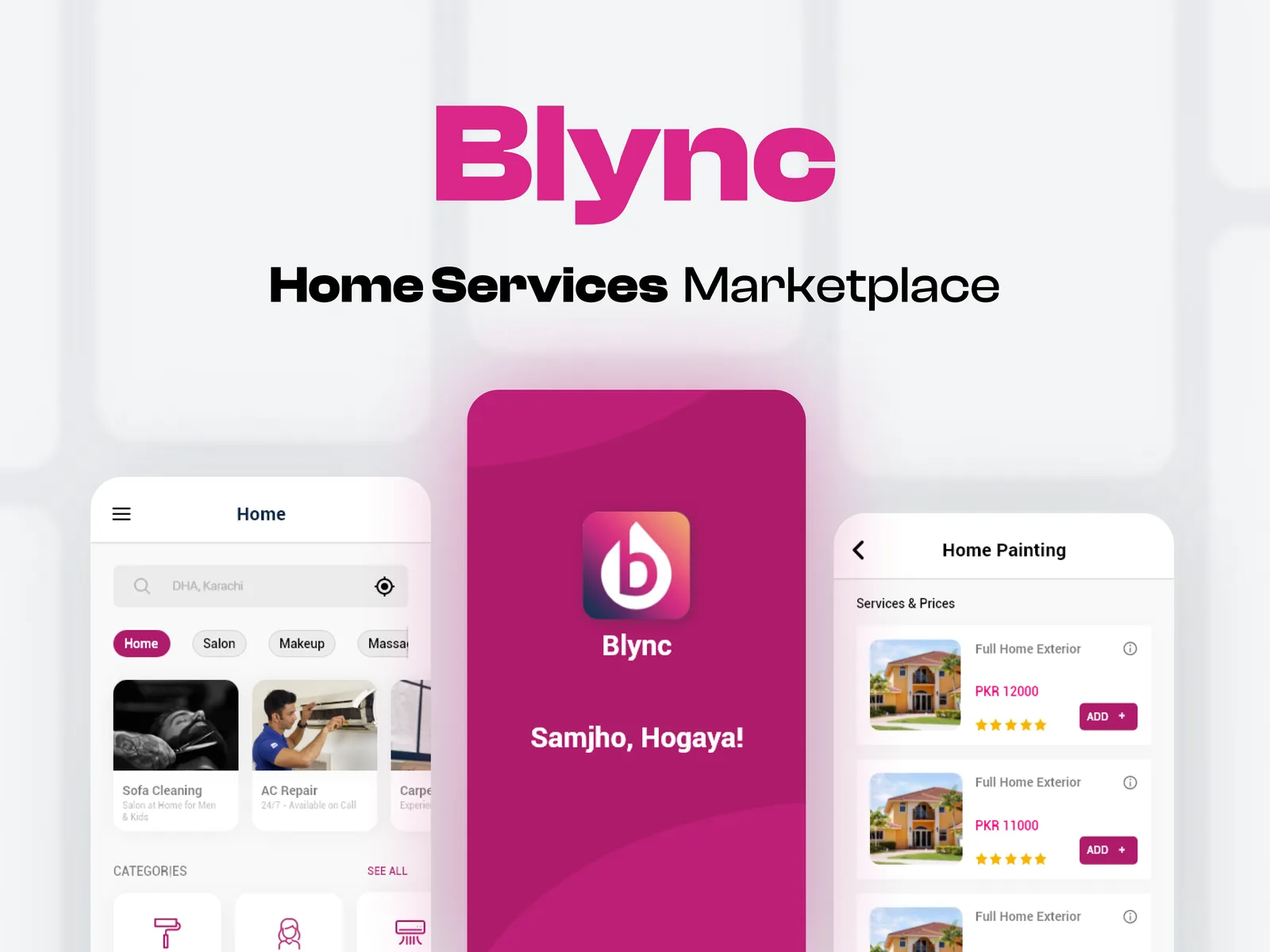
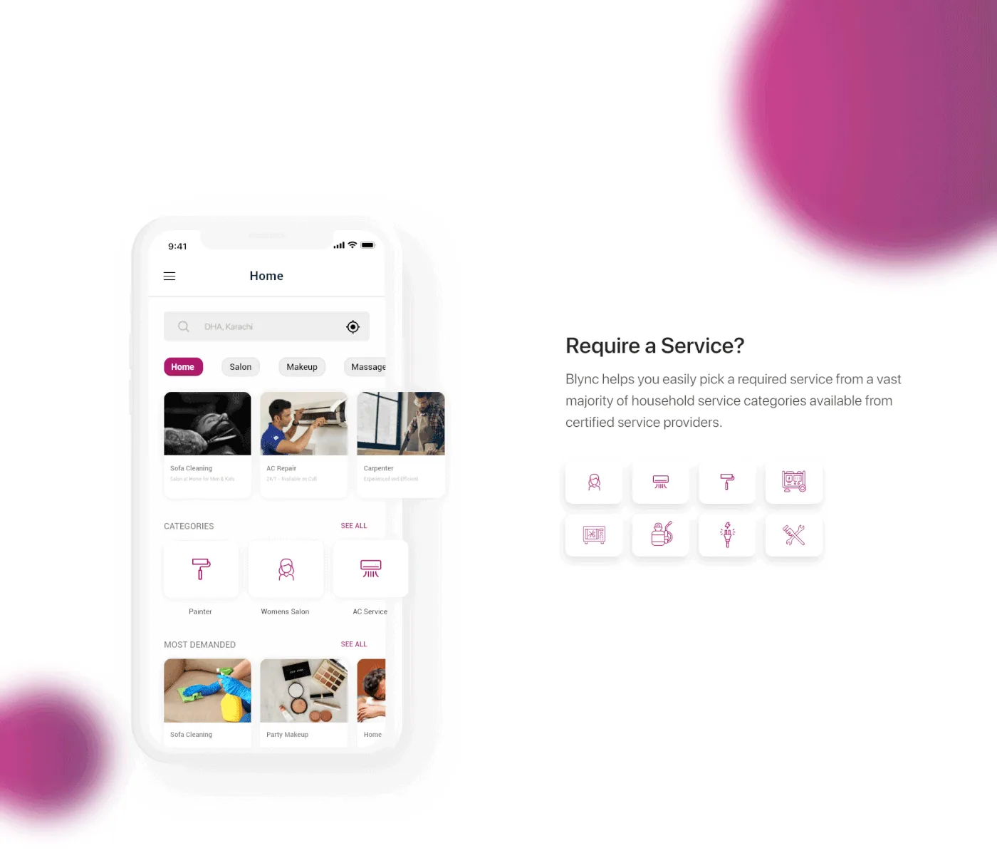
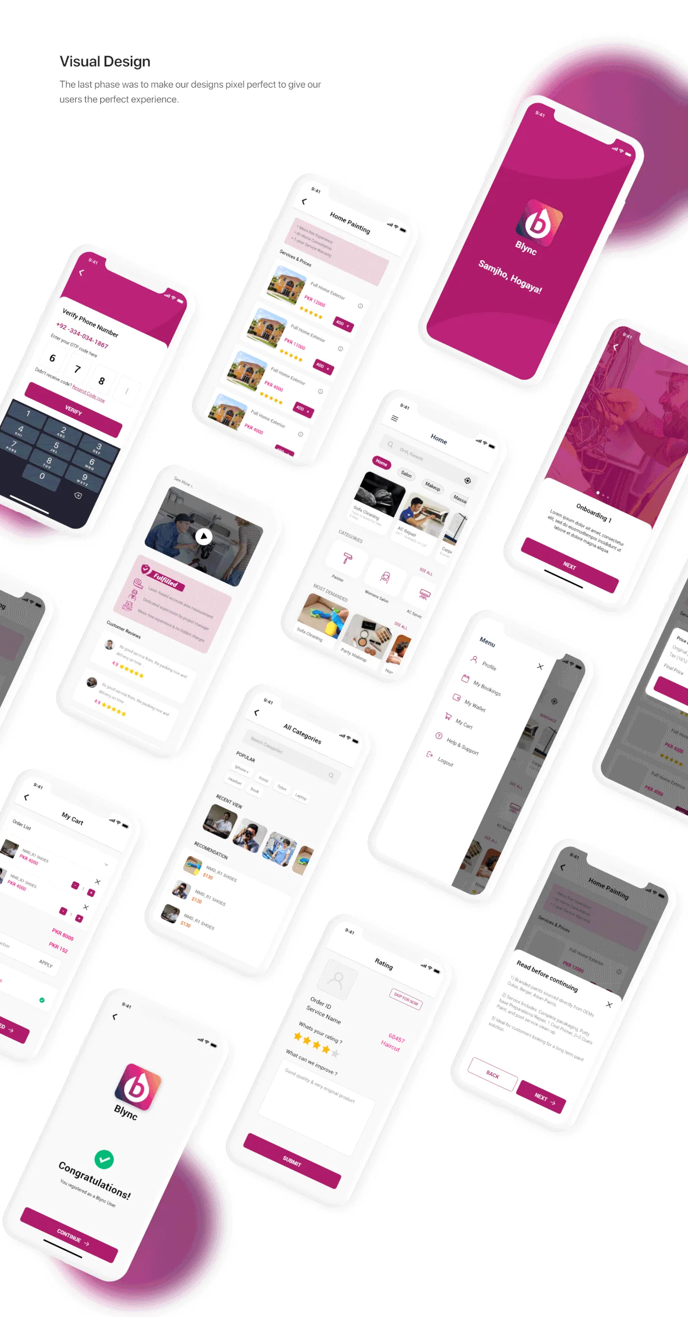
Every service under one roof. The home screen leads with categories — salon, AC repair, painting, appliance, cleaning, electrical — so the vast majority of household jobs are two taps away, all from certified providers.
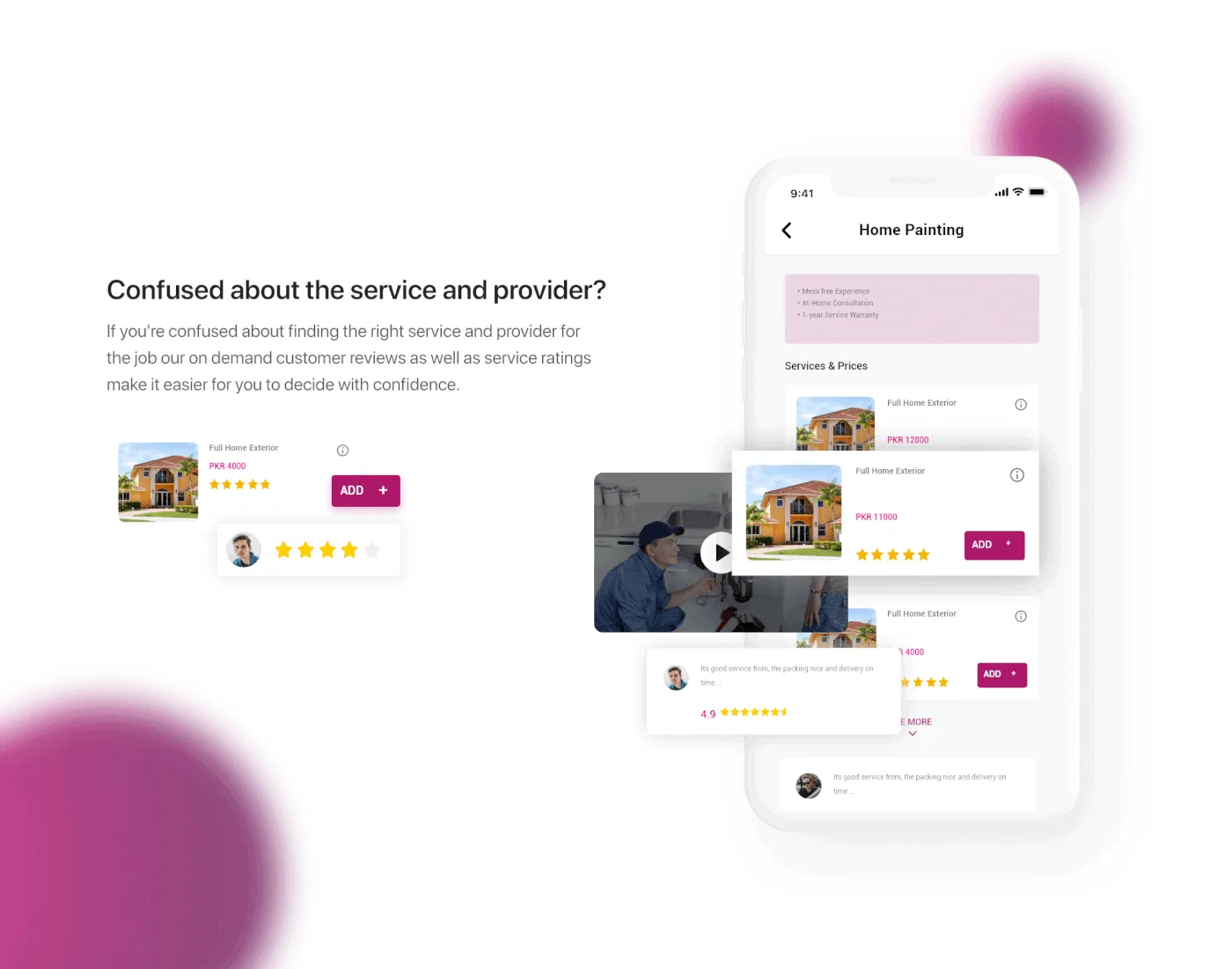
Reviews carry the trust. Kashif’s hardest problem was not knowing whether a vendor was any good. On-demand customer reviews and service ratings sit on the provider, at the moment of choosing, so the decision can be made with confidence rather than by referral.
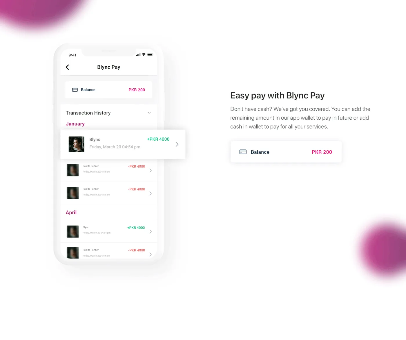
Blync Pay. A wallet with transaction history, so a job can be part-paid, topped up, or settled later — cash is not always in the room when the work is done.
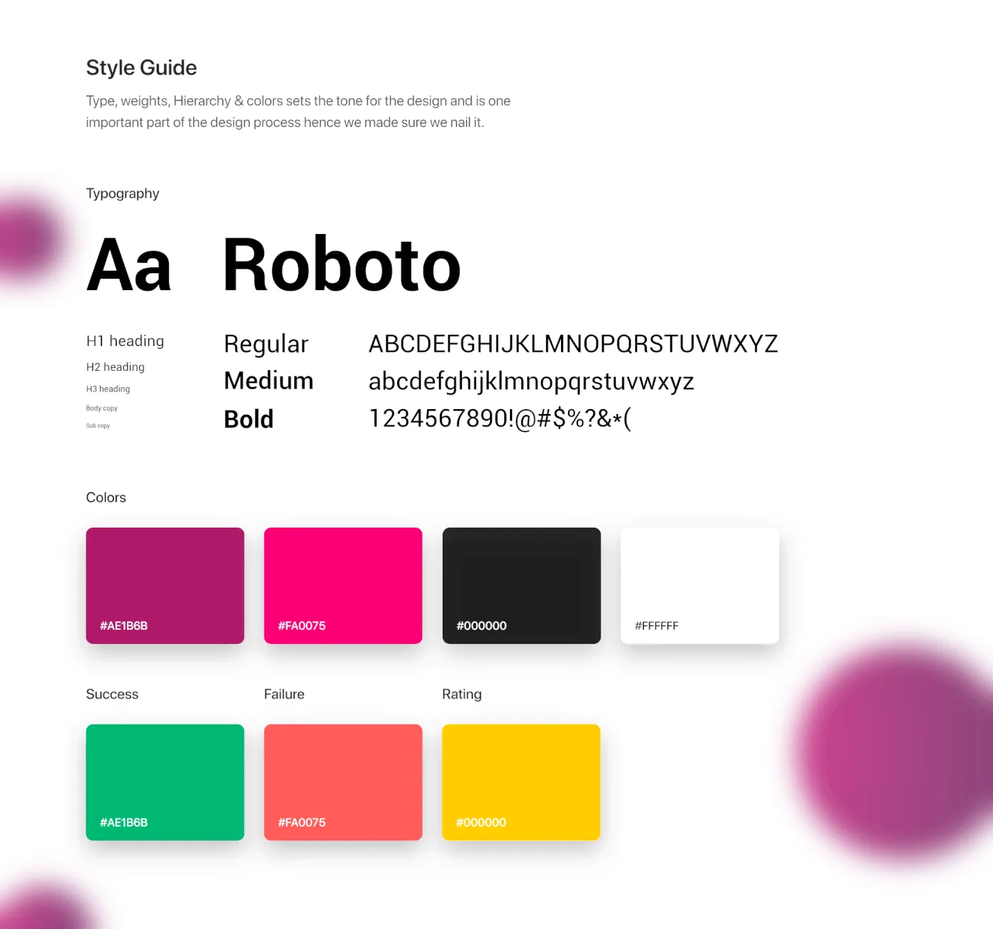
A system, not a set of screens. Roboto throughout, a magenta that carries every action, and semantic colours for success, failure and rating — written down, because brand rules are no good if nobody follows them.
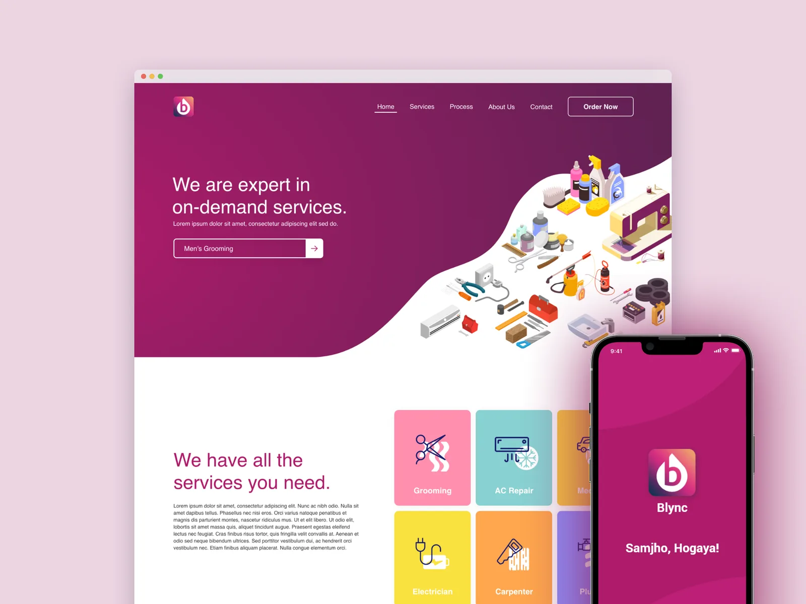
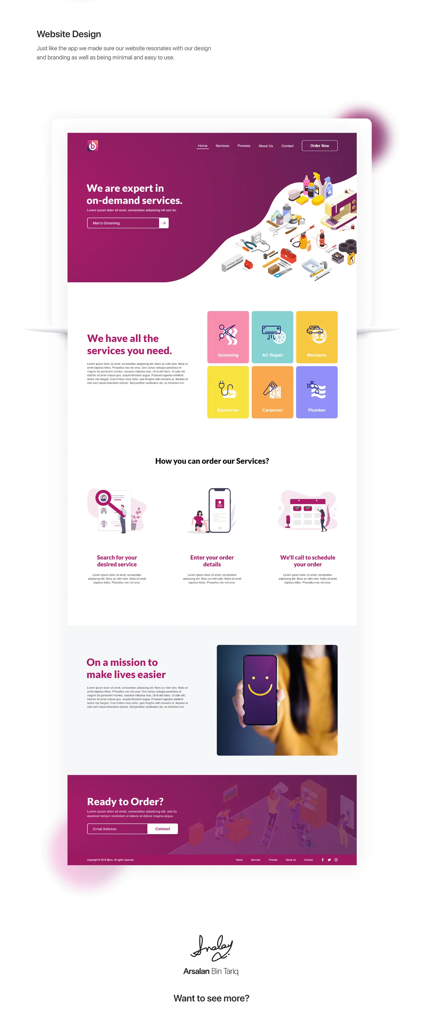
And the site. The marketplace needed a front door for people who had not installed anything yet.
Outcome
Blync shipped as a marketplace with both sides designed: an app that books certified providers at fixed prices with real appointments, a wallet, a review system that carries the trust the category was missing, and a site to bring people in.
Every frustration on the persona card has a screen answering it. That was the test I set at the start, and it is the one I would still use.
Public performance numbers for this one are not mine to publish.
Reflection
One persona was the right call for speed and the wrong call for coverage. Kashif is the household decision-maker; the person who actually opens the door to the plumber is often someone else in the house, and I never designed for them.
I would also put the provider’s own experience in scope. We designed the demand side thoroughly and assumed supply would follow — and a marketplace only works if the people doing the work want to be there.