Atompoint
A website re-design for the digital product studio I worked inside — dark, immersive, and built on a system the team could keep using.
At a glance
- role
- UX & UI, design system
- company
- Atompoint
- year
- 2021
- platform
- Responsive web
- scope
- Sitemap, grid, style guide, full site
- tools
- Adobe XD, Illustrator, Photoshop
Context
Atompoint is a team of diverse and collaborative tech geeks who love to solve real-world problems through the synergy of cutting-edge technology, design and process. Mobile apps, enterprise applications, websites, marketplaces and IoT integrations — with a stated ambition to be making self-generative robots, hoverboards and intergalactic portals tomorrow.
This was my own studio. I was the UX Design Specialist there, which made it the hardest kind of client: everyone had an opinion, and everyone was a colleague.
Problem
A studio’s own website is the one piece of work every prospective client sees before they see anything else. It has to demonstrate the capability it is describing — a technology studio with a flat, ordinary site is arguing against itself.
What it had to do at once
- Prove technical ambition through the site itself, not through claims about it
- Hold work as different as enterprise applications and IoT integrations in one portfolio
- Speak to a buyer who is comparing four studios in one afternoon
- Stay buildable by the team who would maintain it after I moved on
That last constraint shaped everything. An immersive site that only its designer can extend is a liability dressed as a showpiece.
Process
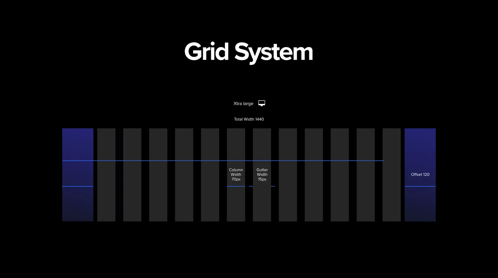
Sitemap, then grid, then language — the order I use whenever a site has to survive the person who made it.
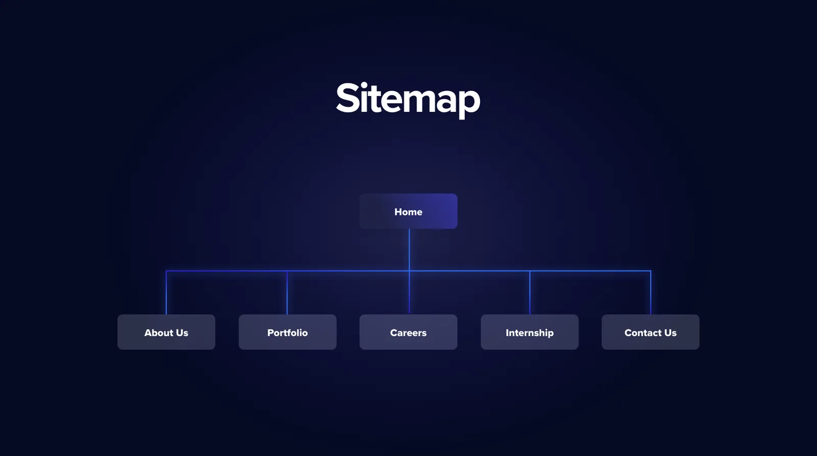
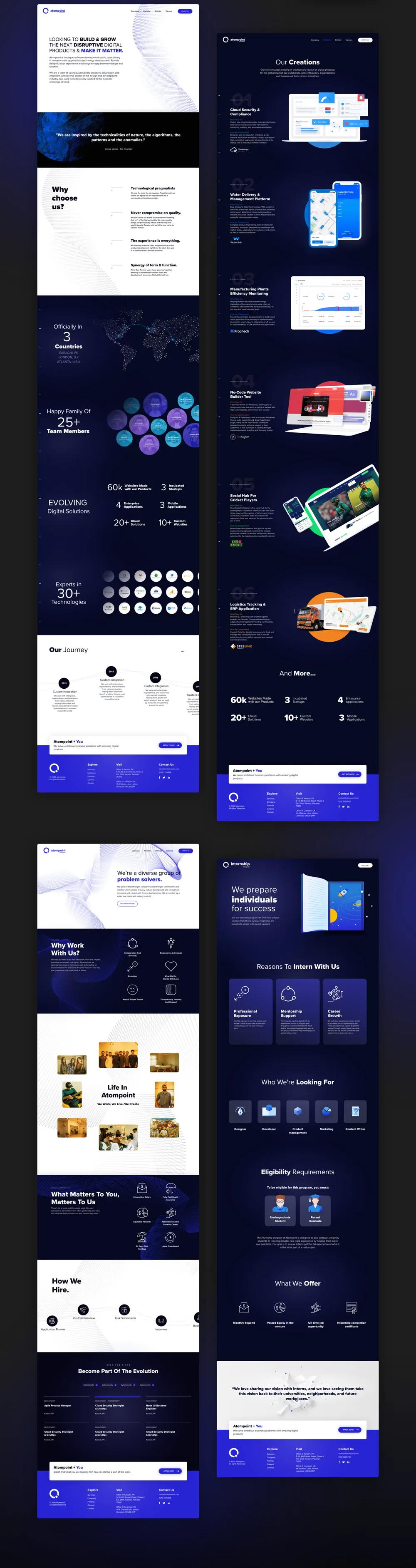
Home branching to About, Portfolio, Careers, Internship and Contact: small enough to hold in your head, with room for the studio to grow into it.
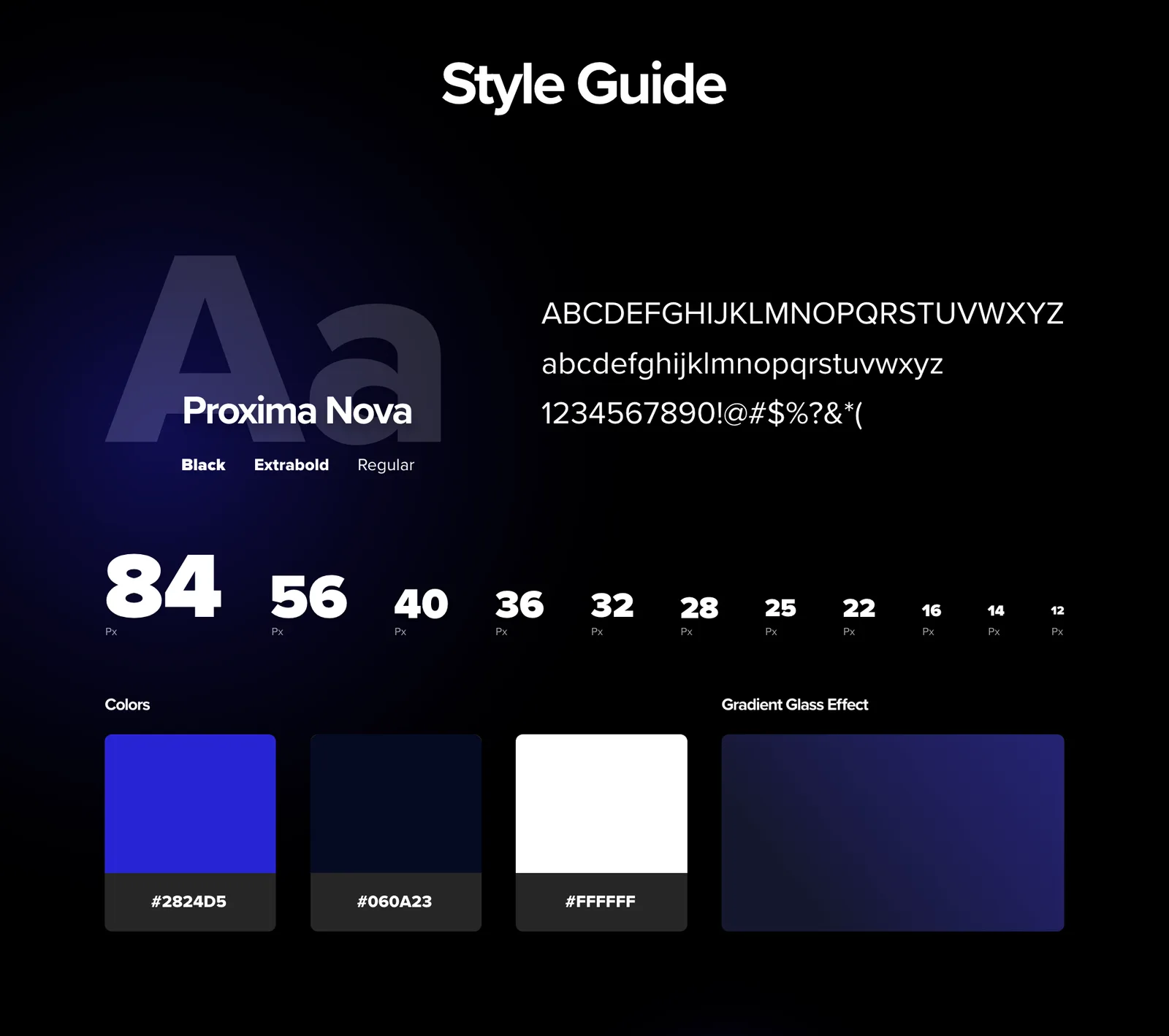
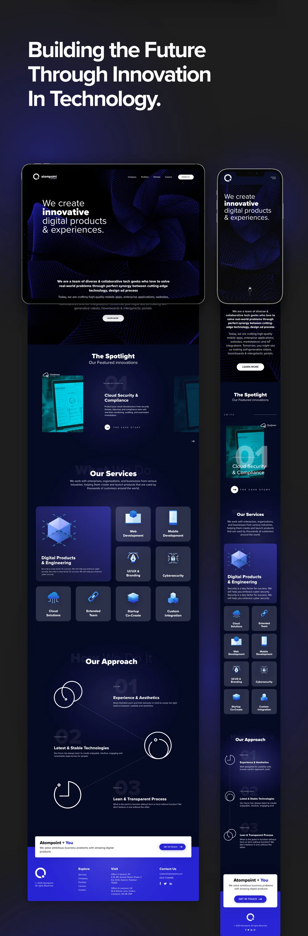
The language is deliberately narrow. Proxima Nova across an eight-step scale from 84px down to 22px, an electric blue against near-black, white, and one glass gradient. Four decisions, applied everywhere, which is what makes a dark site feel intentional instead of merely dark.
Solution
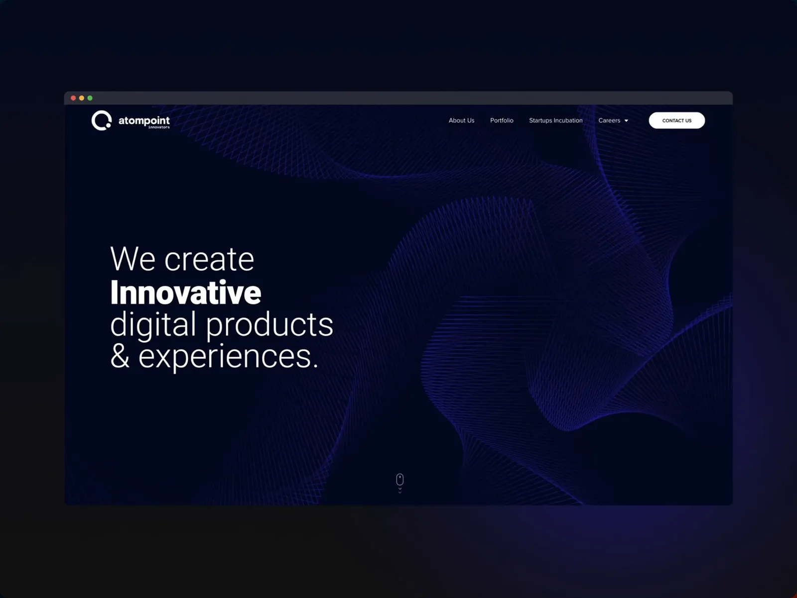
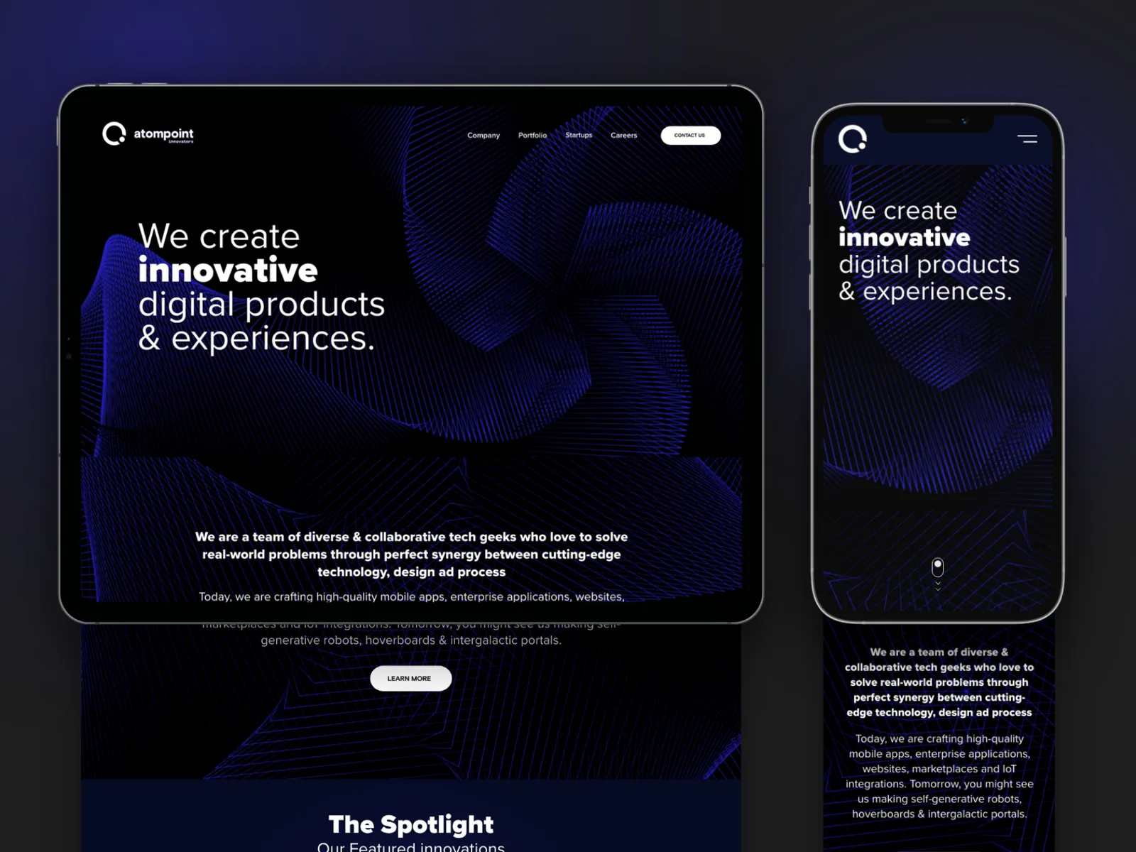
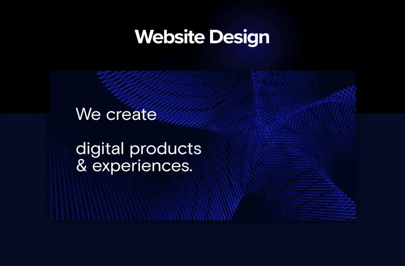
The hero does the arguing. “We create innovative digital products & experiences”, set against a generative blue wireframe that moves — the site demonstrating the capability in its first three seconds rather than describing it in a paragraph.
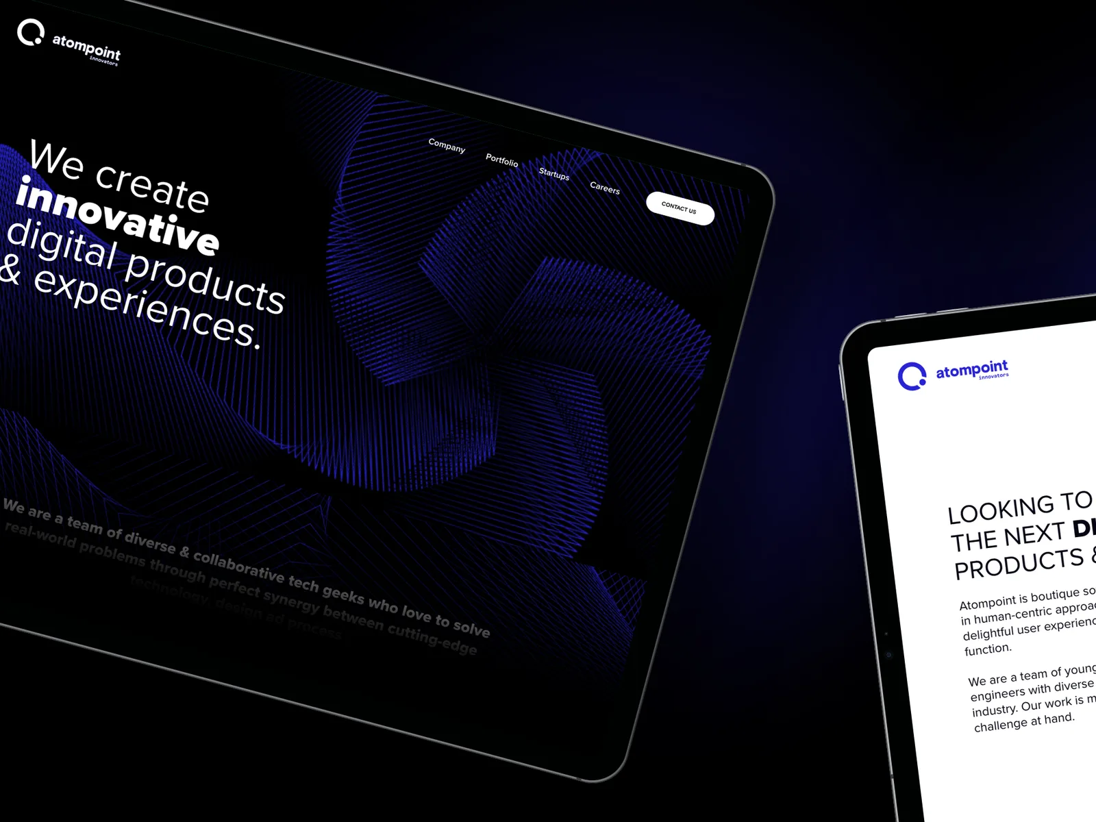
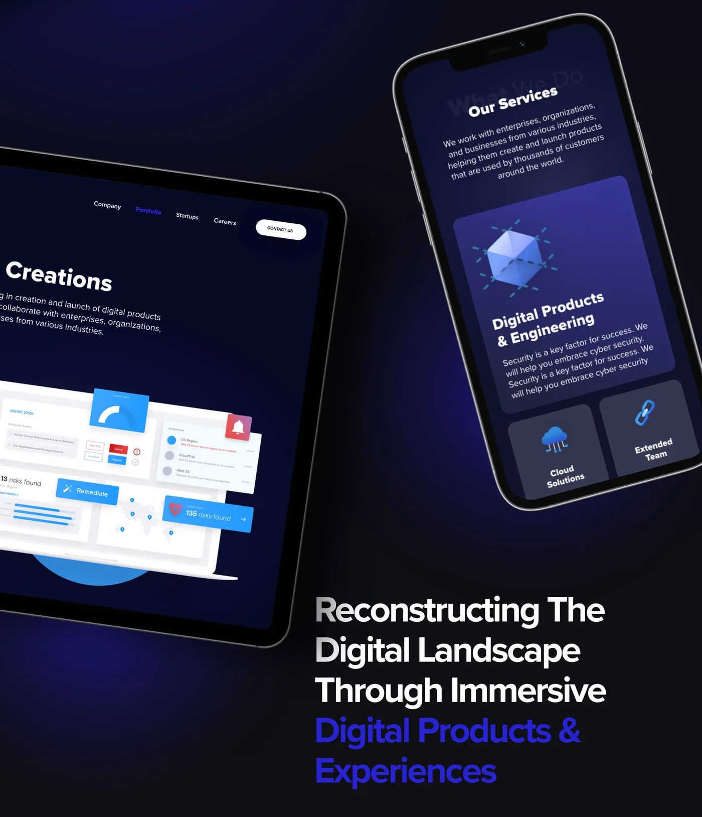
Work shown as work. Creations sit in device mockups across desktop, tablet and phone, so a portfolio of enterprise tools and consumer apps reads as one body of work rather than a mixed bag.
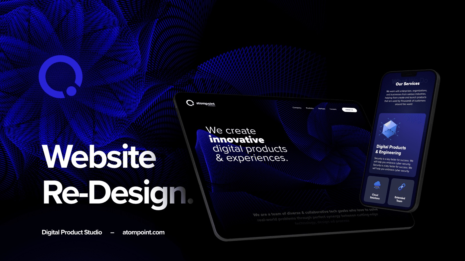
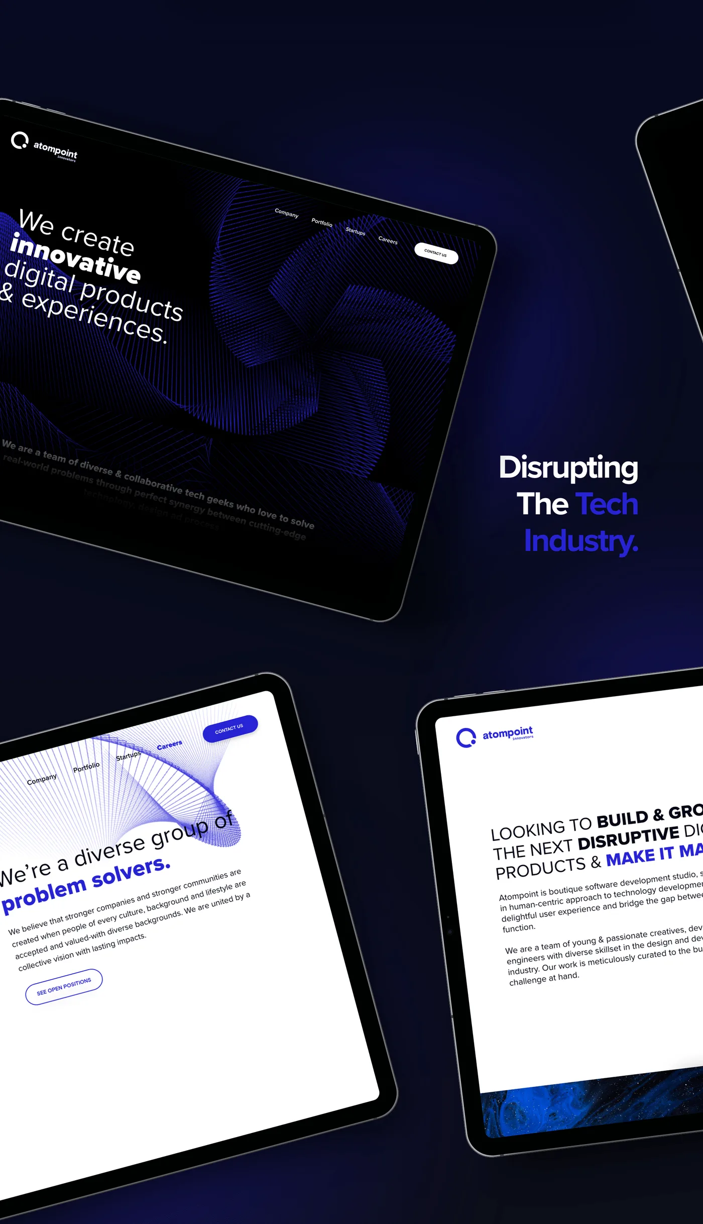
Services, with the studio’s voice intact. “Disrupting the [rotating] industry”, “we’re a diverse group of problem solvers” — the copy the team actually used about themselves, given room rather than sanded down into agency-speak.
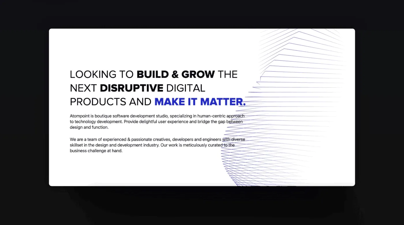
And a close that asks for the work. Looking to build and grow the next disruptive digital product and make it matter — the one moment on the page where the site stops demonstrating and starts asking.
Outcome
Atompoint got a site that argues for the studio by being the kind of thing the studio makes: dark, immersive, and moving where movement means something.
The part I care about is that it outlived my involvement. The sitemap, the grid and the eight-step type scale meant the team could add a page without asking me how — which was the actual brief, even though nobody wrote it down.
Traffic and enquiry figures are Atompoint’s to publish.
Reflection
Designing for your own studio is a trap I walked into with my eyes open. There was no client to say no, so the site is more ambitious than it strictly needed to be, and some of the motion serves the studio’s self-image rather than the visitor’s decision.
I would also cut the hero animation’s weight. It is the first thing a prospect loads, often on a phone, often on a bad connection — and I optimised it for the moment it looks best rather than the moment it matters most.